I was part of a team of designers, developers and key stakeholders, tasked with redesigning the MVP of a tech startup in the logistics industry. At the start of the project, my task was to research and produce wireframes that would improve the user experience of the application. My job evolved to coordinating with development and meeting with the client; the most important contributions I made where the insights that I was able to find with users.
The company, a tech startup in the logistics industry; had developed an app for the logistics industry, to try to simplify one of the more complex processes involving the "last mile" delivery of freight. At the time of Cross.Team being brought in, they were in the process of signing on a new client. The CEO had spent 6 dedicated months on the processes and features for the users, in order to have a robust application for the needs of the users.
The product processes are complex because there are limitations with the time containers can be away from port, scheduling of deliveries, temperatures of refrigerated cargo, unexpected queues at port, and delivery windows for certain locations. Multiplied by over 50 containers in movement at any given time, and different locations they could be in, while also at different stages of the delivery process. The industry is ripe for a solution. The goal for the product is to pack the best practices and achieve lower costs for the customers, with an intuitive user focused interface.
Merge the functionality of two screens into one simple easy to use solution. Without sacrificing features that were developed for the MVP as they were considered 'battle tested'.
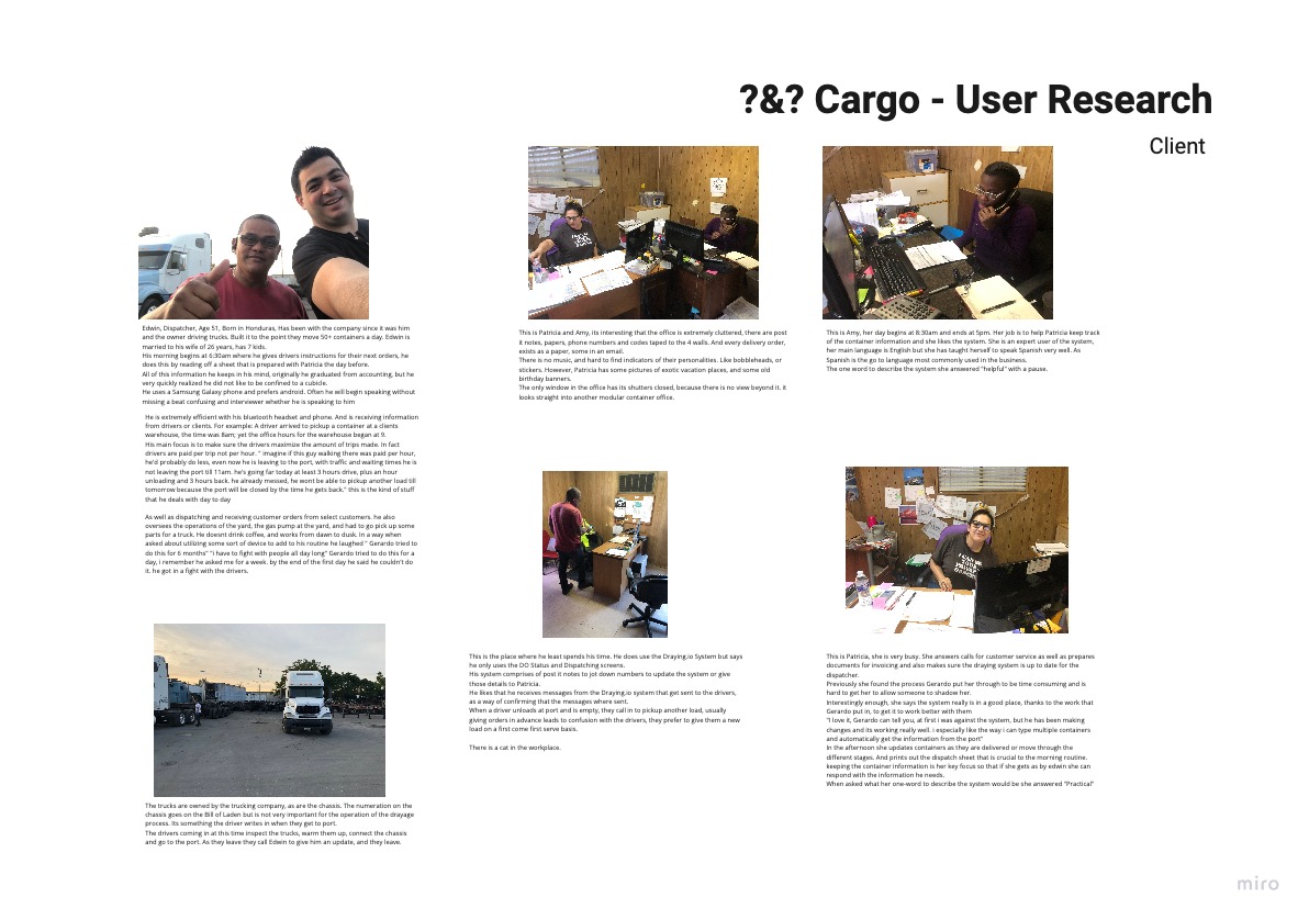
Patricia and Amy AKA 'Power Users
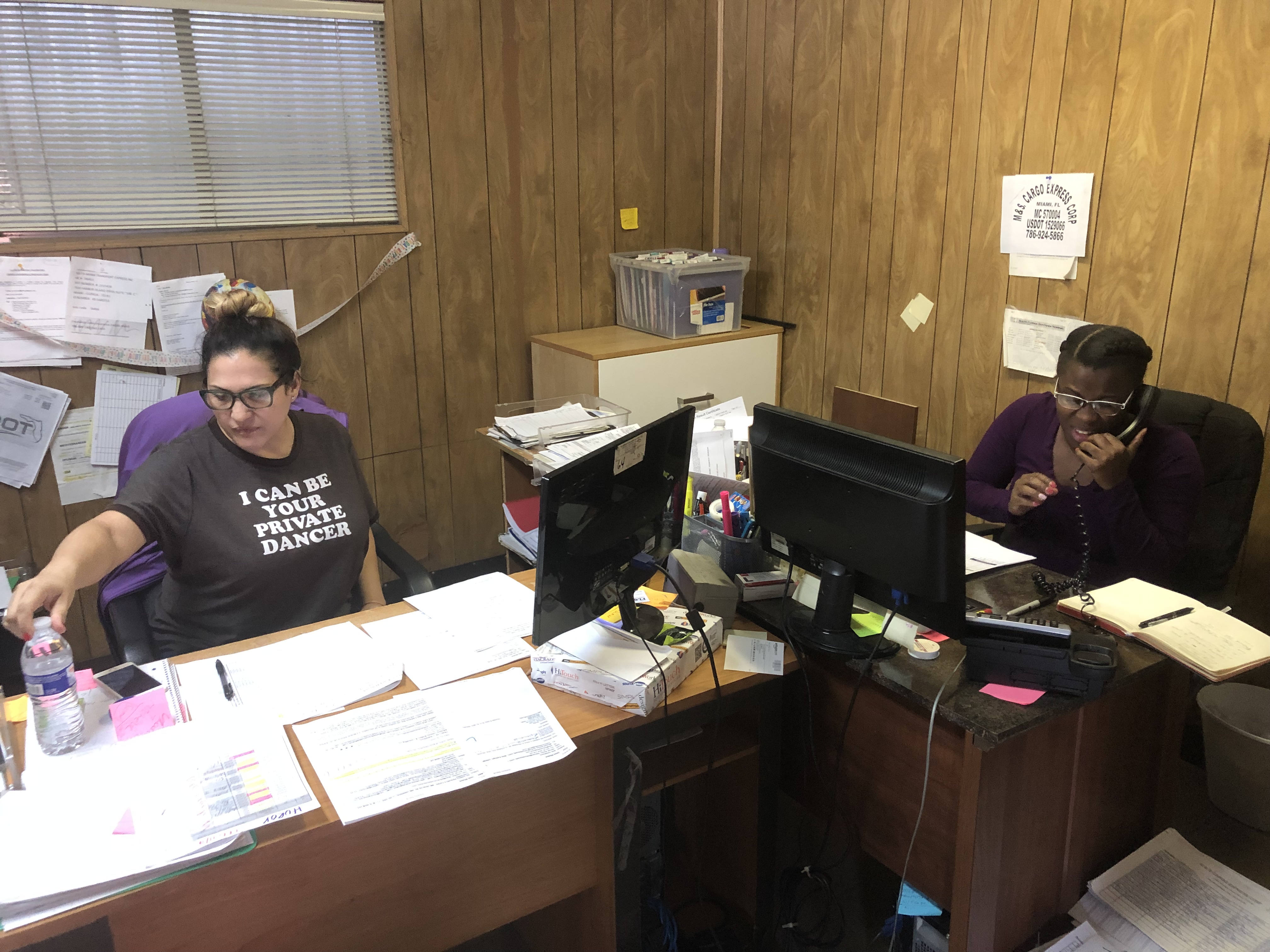
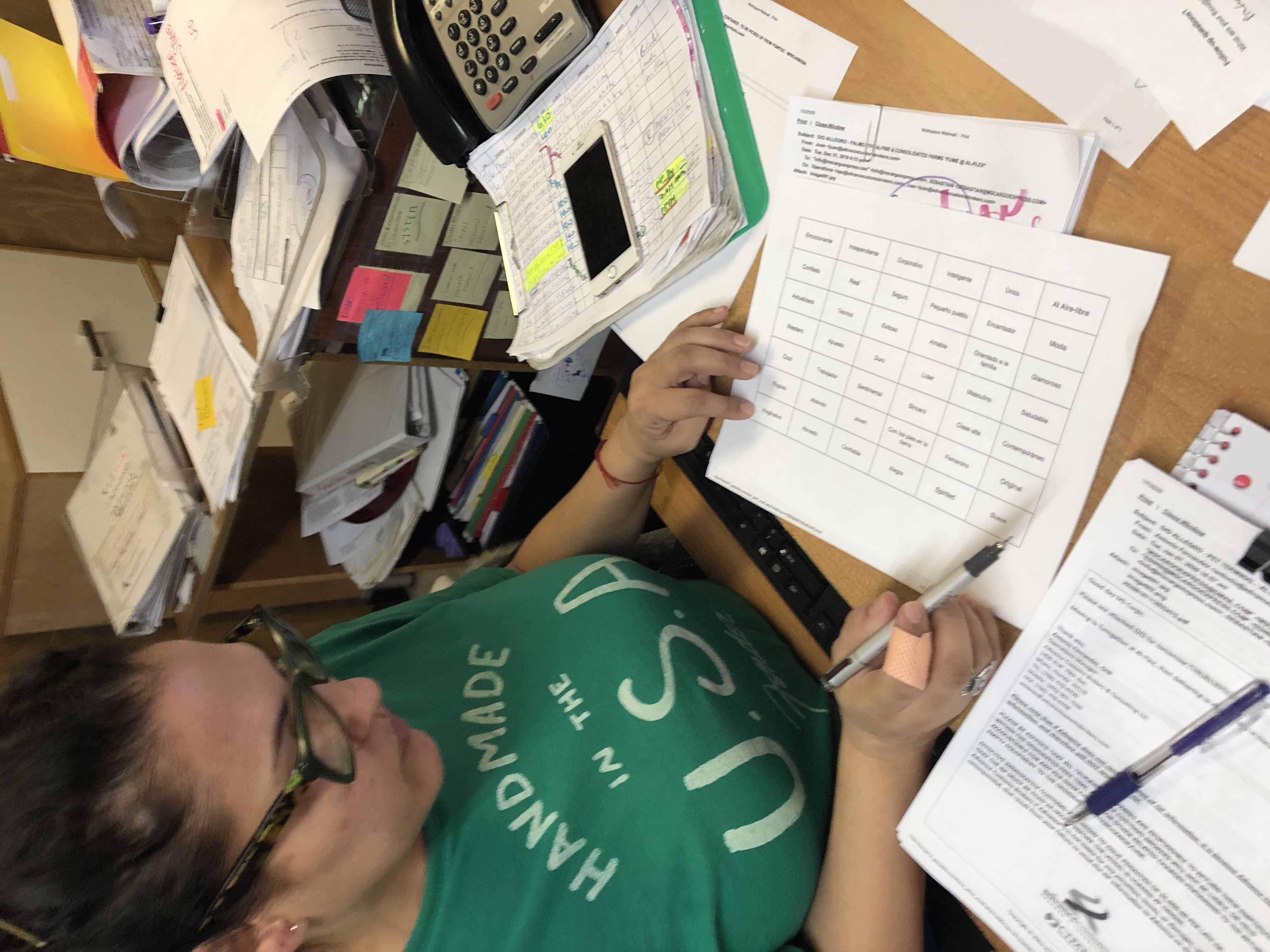
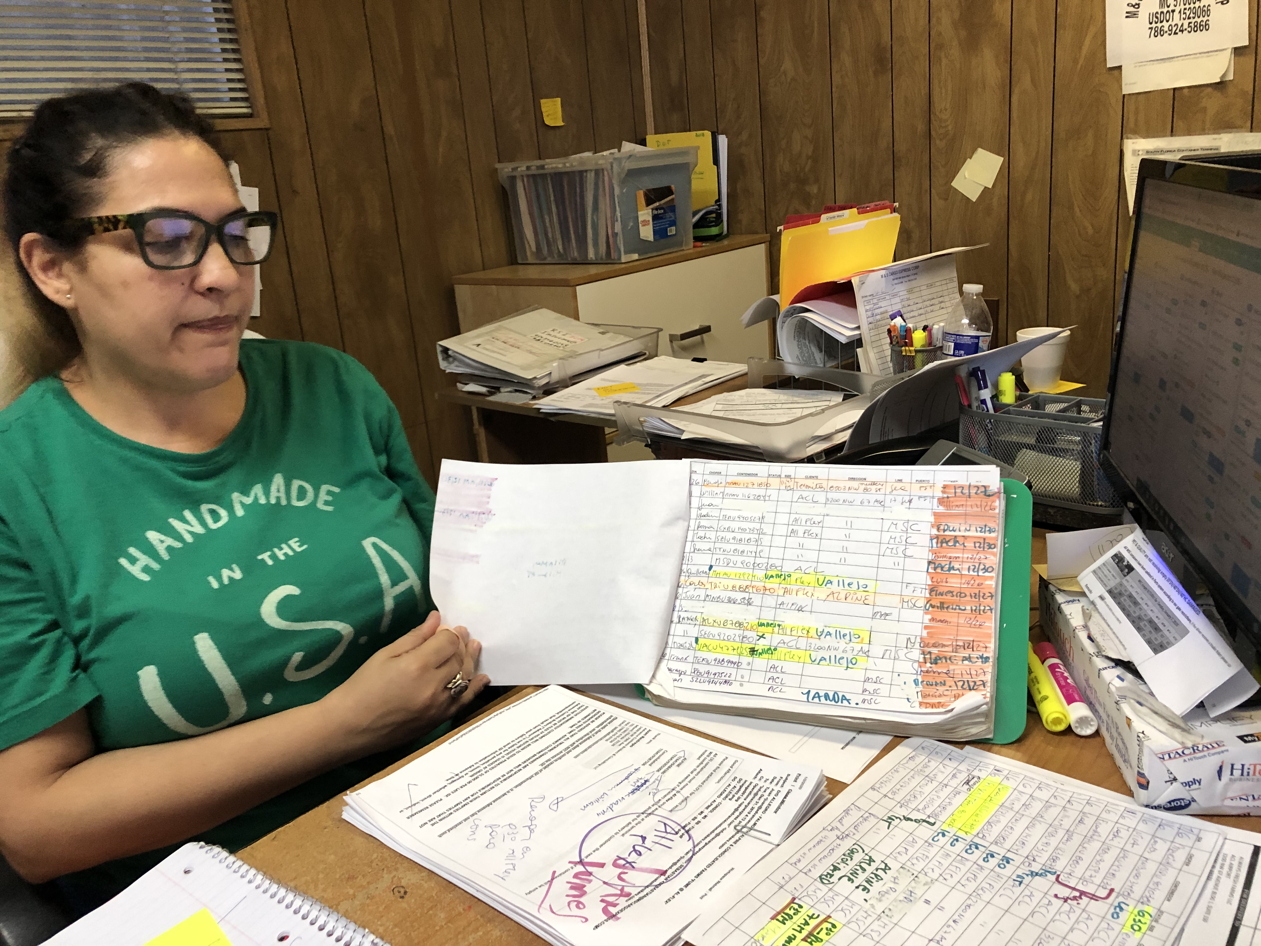
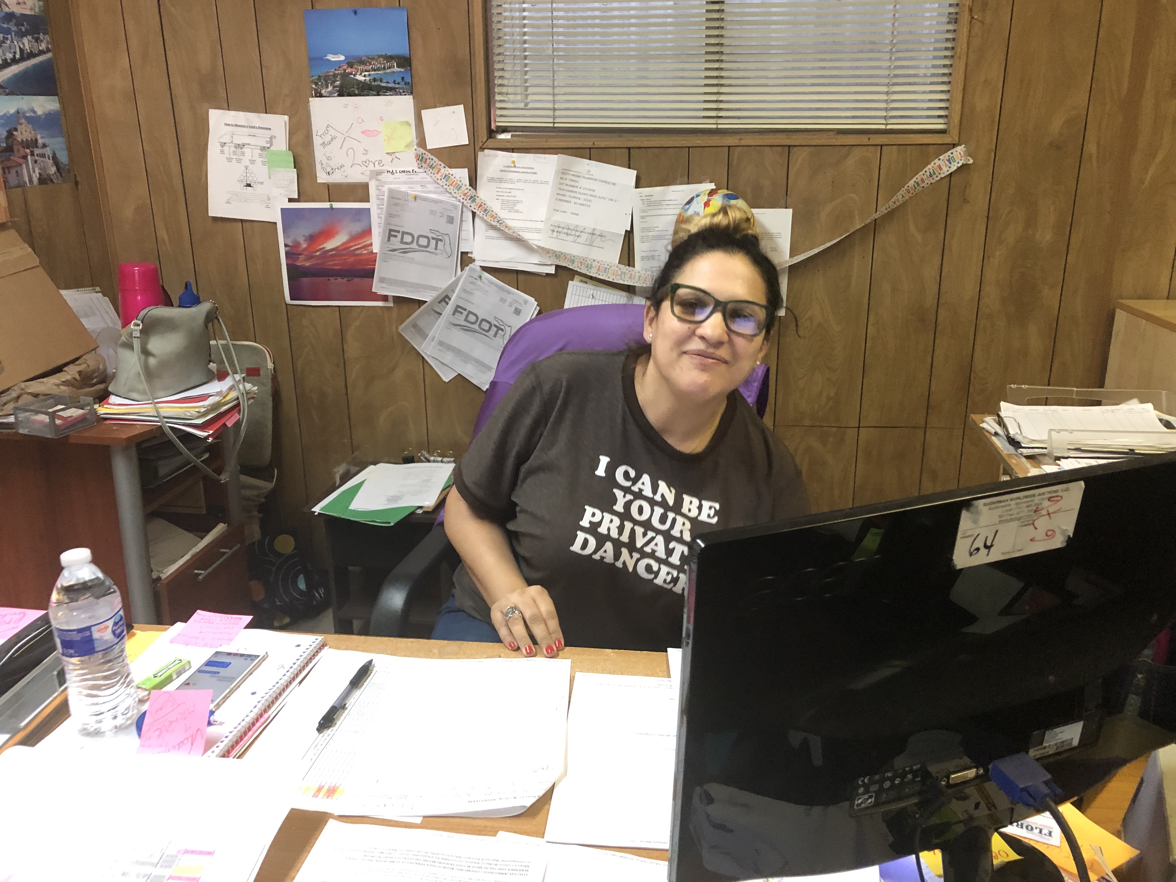
Highly intelligent dispatchers, that have become used to having all the moving processes and calculations done manually; they have sheets of information posted all along the office, as a backup system to what they do on the spot. Spending time with them required not getting in the way of their busy and hectic schedule. After a lot of probing since they felt that the previous 6 months with the Client had been enough to take care of the pain points, I was able to find nuggets of information.

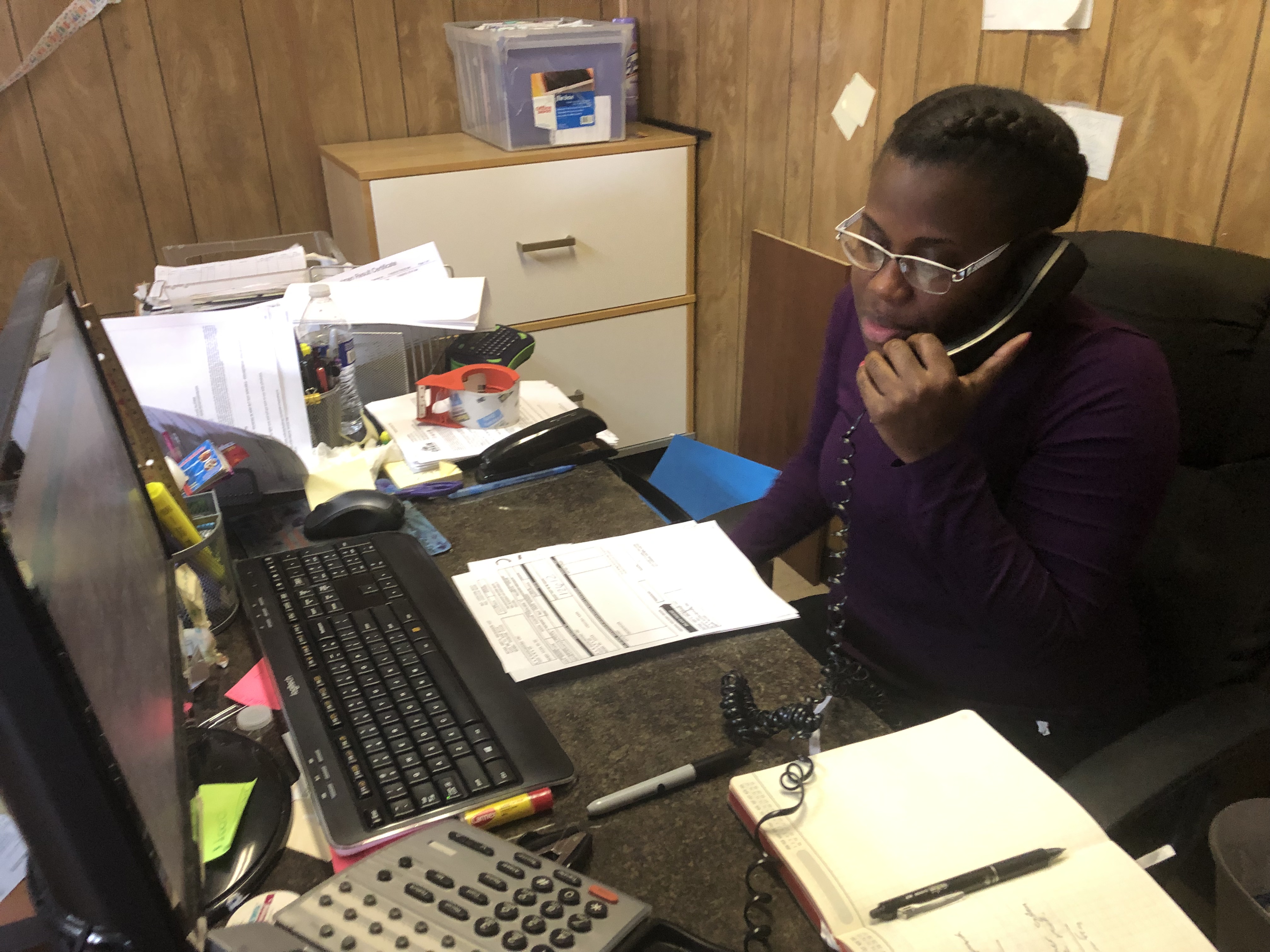
Edwin AKA The Head Dispatcher
Everything going on in the office, as well as everything his truck drivers are running into on the road and at port is run through him and his bluetooth headset. The client had told me to be prepared with this user, because they could not get him to adopt the system in his workflow. The interviews with him were especially fruitful, because it became apparent, that there is a people side to running the logistics company; and by not taking it into account, his view became reasonable. Vast amounts of information came from him, goes to show that a step back can create a leap forward.
.jpg)
.jpg)
.jpg)
.jpg)
.jpg)
.jpg)
Dispatchers do not have the best user experience with the routing and dispatching screens,
We believe that Tailoring the existing features to the users workflow and mental models (driver-based thinking)
We will increase dispatcher adoption of the screens and use of more of the apps features.
.jpg)
At this point we had to make sure that the existing features and functionality, would be available on the screens and taken into consideration in the design. This meant understanding how data was handled in the back end and where those points met the front end.
As the project progressed the requirements changed, as there would be a development of the application in react, as well as a GraphQL layer to improve the way the API where called, the meetings with the developers was very challenging at first because the naming conventions on the back end, could have several meanings on our side. A lot of time was spent untangling the meaning of processes, and without documentation in the MVP, the team collaborated on documenting as we went along, to streamline things over time.
.jpg)
.jpg)
.jpg)
.jpg)
.jpg)
.jpg)
.png)
.jpg)
.jpg)
Sketching out the components that make up each screen and doing some field mapping while I was at it, allowed me to build these screens on paper very quickly.
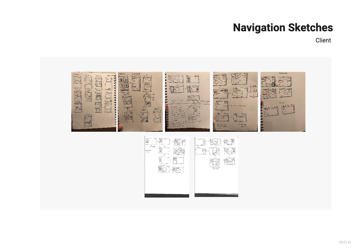
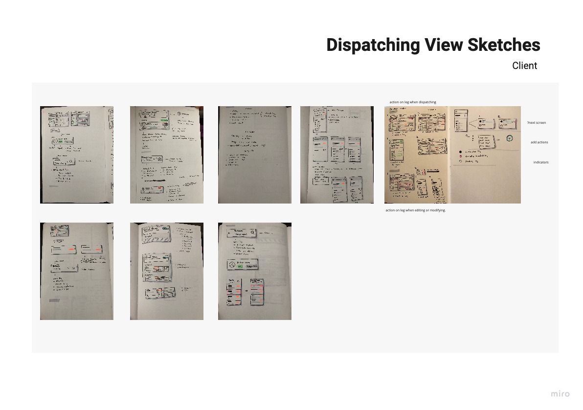
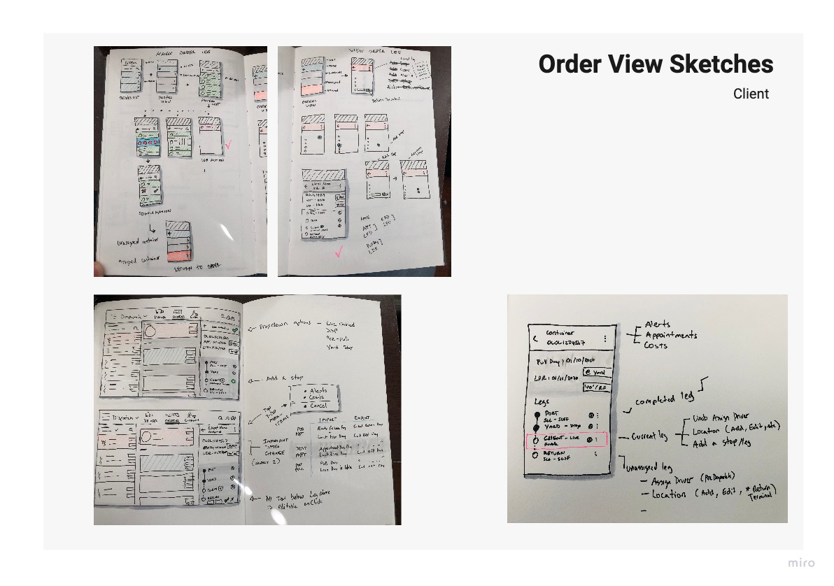
By this time I had spent so much time sketching, that I went with paper prototyping to increase the workflow and reduce the redundancy of some sketches.
.jpg)
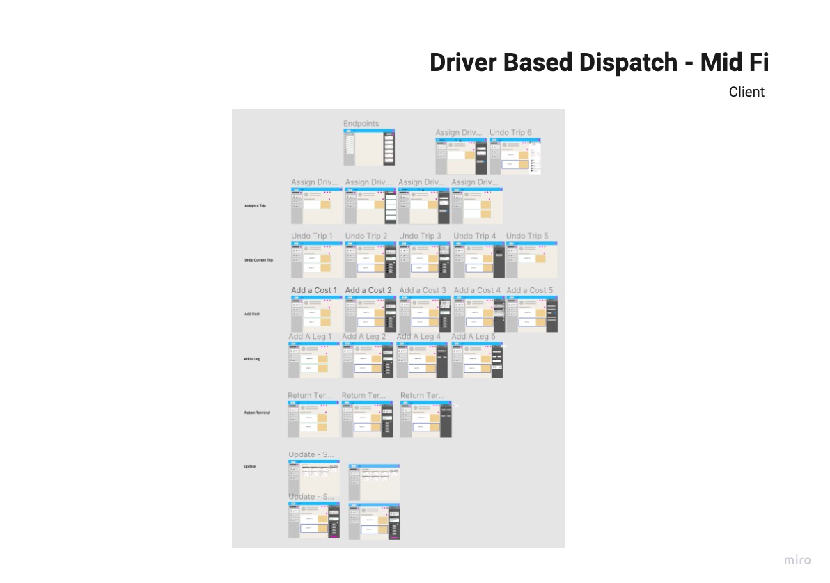
Before developing in React, the client asked for a “quick and dirty” version to roll out on the current stack. Although, not very appealing, the usability report showed success. Below is the actual report I produced.
After the “frankenversion’, the first visual design exploration, was designed with mobile view first and I kept to the material.io guidelines on columns for device screens as well as alignment to an 8-pixel grid.

The client approved the screens for development and team grew. The project expanded to an overhaul of the whole product from just a few screens, I began user research in other areas for the same client. The screens I delivered went through more changes, mostly on the visual side, and this is what the final version looks like.
The left column allows the dispatcher to search or pick from the drivers. The middle column opens up a detailed view and schedule of what the driver has to do; the small cards represent loads suggested by the system. The right column slides out when the user doesn't want to use the suggested containers, and allows them to select a container from a sortable list.
The client was so happy with the results that they green lighted development of the product in react. I began working on another set of screens for the company at this point.
This was a good project to learn from, it delivered the right level of challenges and setbacks. Overall, the user experience issues were solved, the screens were merged, the users liked it and the client was happy.