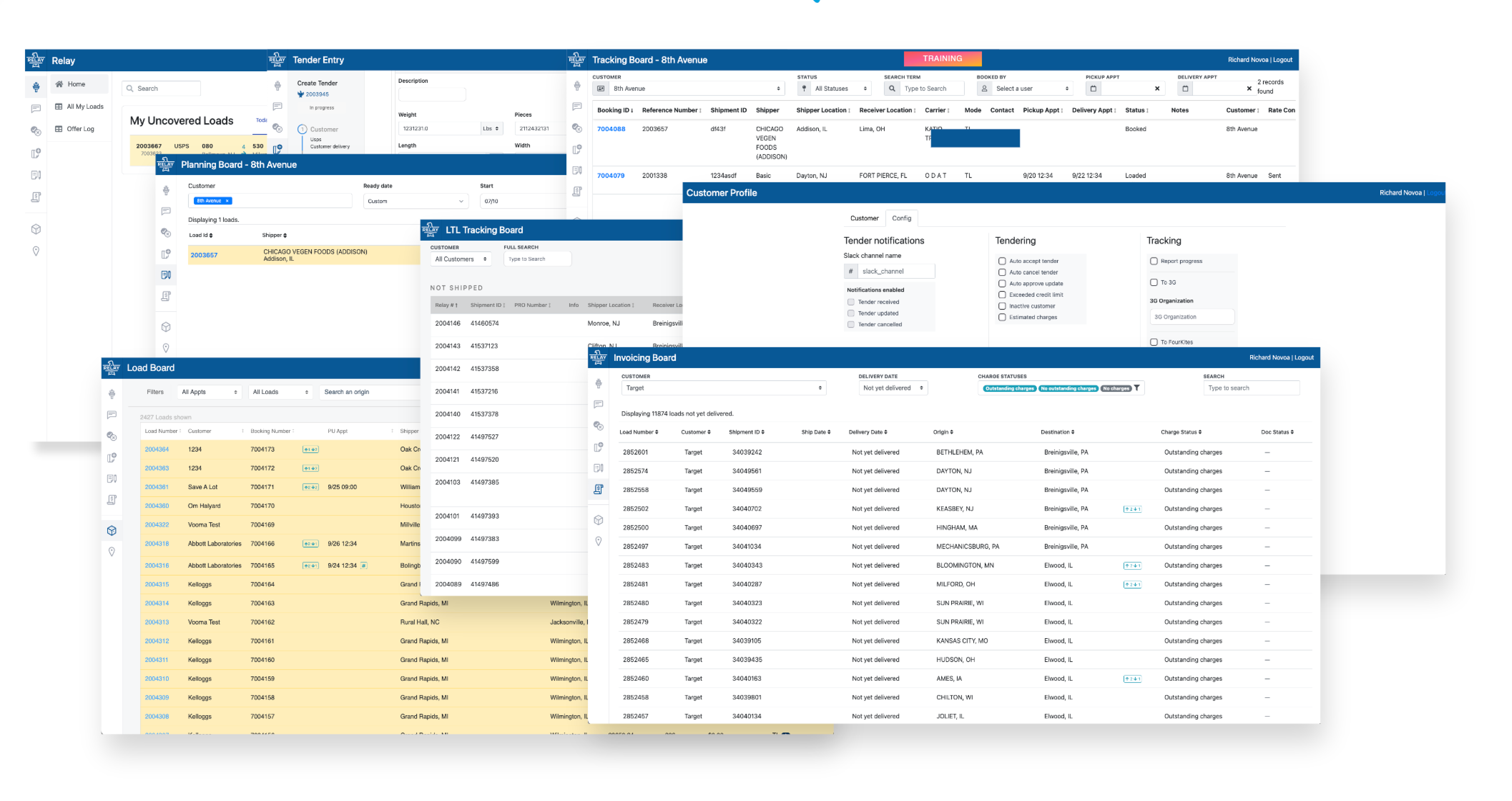
User's had become used to different components to do the same tasks. As the product grew, and new features where introduced, each new app brought with it improvements in functionality and style. Yet more often than not, what was temporary became more permanent; and what was released earlier looked and felt different.
The business had adopted a micro-frontend architecture to launch products faster. This meant teams could work on new apps to solve business challenges independently from other teams or previous work. With this approach, there was some tech debt resulting from dependency updates, new approaches in development (especially in the earlier days of Phoenix LiveView), and visual consistency issues. The stakeholders acknowledged these tradeoffs and, for these reasons, were on board with improving user experience and implementing standardization of reusable components. Along with green-lighting the initiative, the business invested in a digital course for the design team; there's a mini case study from that here.
However, this was not the first initiative on a component library or design system. In fact, there were 3 or 4 libraries and frameworks that existed in the apps. A few were able to bridge the gap between apps; most ended up living in the app they started in. Additionally, there were several CSS/JS frameworks across the apps: CSS, SCSS, Vue.js, Bootstrap, and Tailwind. This led to jarring differences between the ways components looked and, in some cases, how they functioned.
Whatever the solution was going to be, it would have to solve for: Multiple apps, Multiple frameworks & Multiple variations.