
A heuristics analysis of the application revealed pain points around the input and selection of options.
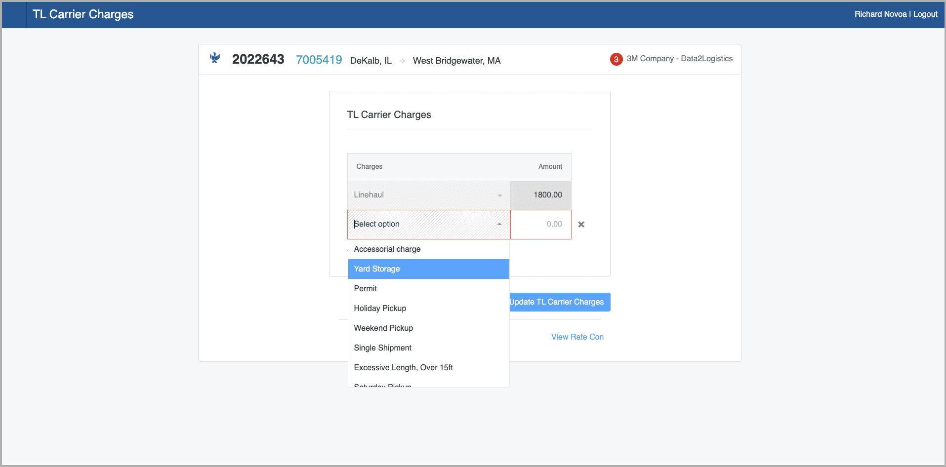
In the case of filters, which users relied on to keep their focus on loads they were working on, the component limited the user experience in two ways. First, most users would rapidly scroll down the list of options before selecting the option they needed. Second, the limitation of the component also limited the app. For example, a user who wanted to look at multiple customers would have to have multiple tabs open because of the single-select nature of the select component available.
By the time the team was ready for this challenge, we had already worked on most of the input components. The new component we had in mind was going to be a bit different because the previous components were stateless. Their feedback was immediately sent to the server, and when the Liveview updated the DOM, the input component already knew how to handle it.
Naming things is pretty hard. We found that the component we had in mind was known by a few names:
At the end of the day it came down to two.


