ROLE
Product Designer
INDUSTRY
Logistics
WORKED ON
User research, Information Architecture, Interface Design, Usability Testing
IMPACT
What Changed
Shifted the client's paradigm
Proved that matching user behavior trumps inherited assumptions about "how logistics software should work"
Made the product speak the business language
The interface now reflects how freight forwarders and trucking companies actually operate, not how someone assumed they should
Earned extended partnership
Initial project expanded to include additional modules, front-end development, GraphQL architecture, and marketplace interface work
DISCOVERY
Get out of the building

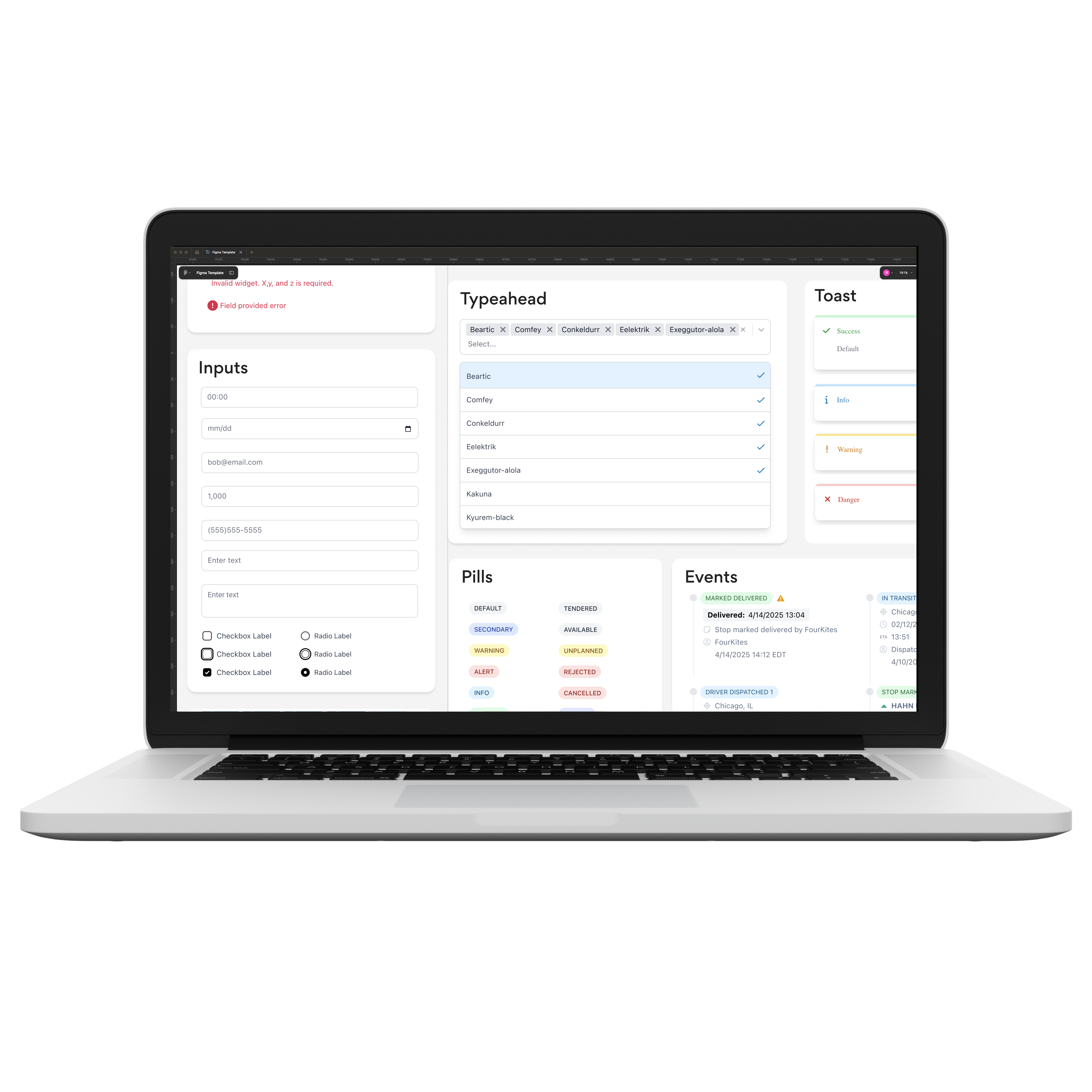
The first time I opened the demo, I was drowning in information. Labels, buttons, color-coded tags scattered across cards—all the clashing colors and competing visual noise made it nearly impossible to see what was actually going on. I didn't fully understand the product yet, but I knew something was fundamentally wrong. Using Nielsen's heuristics, I identified 37 different usability issues and compiled them into an InVision document the team could comment on. It was a crash course in the product, and it gave me ammunition to show the client why they needed a designer doing actual research.

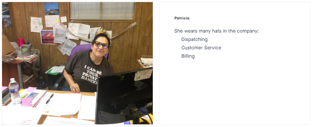
Two days observing dispatchers changed everything. I watched Edwin, the head dispatcher, deal with a driver who arrived late, by 7am, that driver was already locked into an inefficient day. "He won't be able to pick up another load until tomorrow," Edwin explained, "because the port will be closed by the time he gets back." Dispatchers were constantly being asked on the spot what a particular driver was doing, with only seconds to respond. But the system wasn't built for that. It tracked containers, not drivers. Users were jamming Ctrl+F to find information faster than the app's own search. They were translating containers to drivers on whiteboards. The Kanban board showed 50 containers as cards, and it was already unmanageable, scaling to larger operations would be a nightmare. The system was built around the wrong mental model, and users were paying for it every single day.

DEFINE
Getting to shared understanding
Before I could design anything, we had to solve a language problem. Terms like "trip," "leg," and "draying" were being used interchangeably, and you'd have to read context or listen to voice intonation to figure out what someone actually meant. When it came time to organize endpoints for GraphQL schemas and communicate across designers, engineers, and stakeholders, the ambiguity was killing us.

The CTO had all the documentation in his head—we had to help him map things out so others could actually contribute. We sat down with stakeholders and defined the nomenclature, which led to adopting a GraphQL layer that would help with documentation and make the system more accessible to the team.

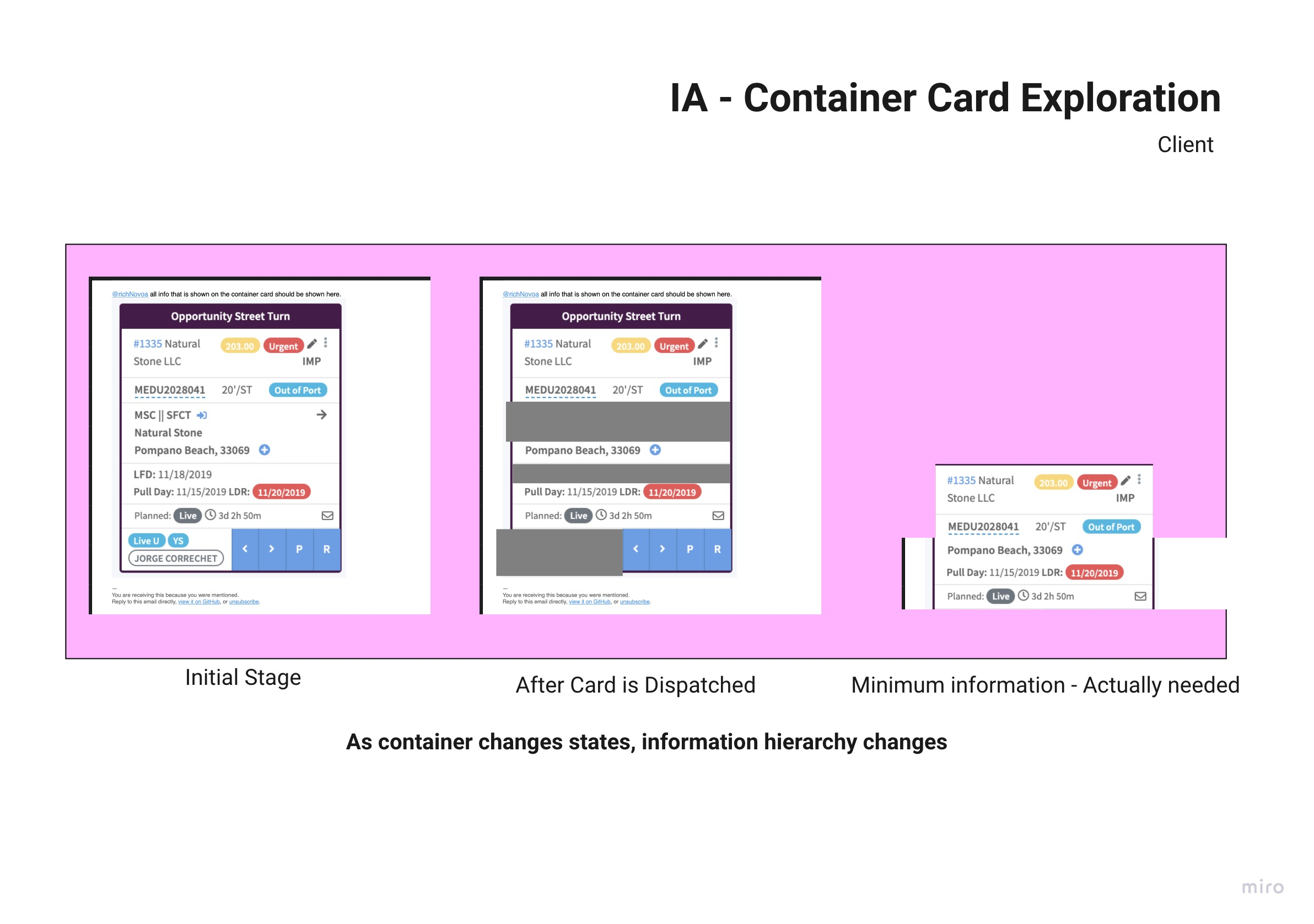
The client had built out a screen specifically for driver capacity, but his users where not using it. Abstracting what the value the client was so invested in actually was meant to do, helped assess if perhaps there was something in the interface that was the root cause. Both screen are actually part of two different tabs in the app.

The concept was simple but radical: flip the entire workflow to start with the driver. A list on the left-most column showing all drivers, select one, and you'd see their details page where you could match and assign containers based on their capacity.

The focus shifted from tracking containers to managing driver capacity, matching how dispatchers were already thinking, not how the system had been built. This was a completely different direction than anything that had come up in client discussions. My boss liked the work and let me present it. The client's reaction? They immediately saw the value and wanted to move forward. That wireframe became the foundation for everything that followed.

DEVELOP
Simplifying the interface
After the client approved the driver-first concept, I dove into sketching each component of the dispatching experience. The app was going to be mobile friendly, I had to simplify the workflows to get the same functionality in a limited viewport space.

Then I had to focus on each individual component, and map out different states and variations, in order to have a sketch. This saves loads of time because it's really fast to iterate on components, and think through all the things a component must do.


Working with that constraint forced me to be ruthless about what information actually mattered. I mapped every endpoint and made my way up to the Kanban cards. It became obvious: not all information was relevant as containers moved through the stages of drayage. So I started to field map what the card needed to display with some stickies.

I cleaned up my findings and but them in an excel sheet and continued to fill it out in conversations with the CTO.

Ultimately a lot of the visual noise came from showing everything at all times. If a container didn't have hazardous material, why display an inactive component for it? the exploration below was whe it all clicked—why not progressively disclose information?
While this was going on, I was diligently translating sketches into Figma. By then I had already done a visual exploration of the interface using with a MaterialUI base components.

As the visual design progressed, the senior designers pushed me further. Based on user familiarity with the data, we could strip even more—removing labels like "Container #," "Driver," and "Status" because users recognized the information by format, position, and context. The cards kept getting cleaner. But that came later.

THE CHALLENGE
If it ain't broke why fix it?
When I presented the cleaner card design to the client, they went quiet. Uncertain. I'd stripped away the visual chaos they'd spent six months refining with users, all those colors, badges, and labels that dispatchers had grown accustomed to. The founder had warned us: "If it isn't broken, it doesn't need fixing." Previous UI changes hadn't been well received. This was considered the first "working" version, and we should expect pushback. The stakes were real, what if users couldn't work without all that information staring at them?
We proposed usability testing to validate the changes, but there was a problem: users wanted to work with real data, not dummy content. We needed to move fast. So we ended up building a Frankenstein version, the old interface with the elements of the new one. It wasn't elegant, but it would let us test the core question: could dispatchers actually do their jobs with this much visual noise removed? I'd cracked the progressive disclosure concept on paper, but now we'd find out if it actually worked.
.png)
RESOLUTION
User Insights
I shadowed two dispatchers, focusing on whether the driver-based flow would resonate and whether users could work effectively with the cleaner design.

The answer came quickly: the simplified cards worked. Users adapted without confusion, dispatching loads smoothly despite all the visual noise we'd stripped away. There were minor flaws from the Frankenstein implementation, rough edges we'd polish in proper development, but the core concept was validated. More importantly, users got excited. They started pulling out artifacts they'd been using to work around the system: spreadsheets tracking reefer loads that the app couldn't handle, workarounds for temperature settings and time limitations, manual processes for prioritizing opportunity turns so drivers could pick up loads just in time before port closing. As well as their own manual spreadsheet, a sign that there was still a lot of work to do for the user's to trust the application.


The usability test revealed far more than whether clean cards worked, it exposed systemic gaps the app wasn't addressing. Buttons that could accidentally dispatch loads to dates in the past. Refrigerated containers requiring extra trip legs that weren't supported. Progress indicators that didn't update when orders were dispatched. We'd validated the design direction, but we'd also demonstrated something more valuable: a systematic approach to understanding what users actually needed. The cleaner cards earned approval. The research methodology earned something bigger.

DELIVER
Let's keep working together
We proved the entire driver-based paradigm worked. More importantly, the systematic research approach uncovered operational gaps the client didn't know existed: reefer loads tracked on spreadsheets, missing temperature controls, dispatch errors nobody had flagged. That depth of insight changed the conversation. The client adopted the driver-based flow as the path forward and gained confidence to tackle bigger growth opportunities with the team. What started as a single interface redesign expanded into a months-long engagement covering additional modules, front-end development, and work on their marketplace interface.
The GraphQL layer we helped establish solved a critical problem, documentation that had lived entirely in the CTO's head finally existed in a structure others could contribute to. The research-driven methodology continued on the marketplace work, starting with visiting a freight forwarding office to understand their workflows before even sketching any designs. The client kept investing because they'd seen what systematic discovery could unlock.
When the senior designers showed the client what the app was going to look like, many visual iterations after my design, his jaw dropped!

TAKEAWAYS
Craft & Execution
This project taught me that design isn't a linear process, it's a series of iterative loops. User insights would reshape our direction, client requests would require pivots, technical constraints would force rethinking. I learned early that you can't just march forward; you have to stay nimble and organized enough to show a client whatever they need at the drop of a hat. That readiness mattered when talks about front-end work started and we needed to quickly build the Frankenstein UI to keep momentum going. My favorite moment was when Marcelo, my boss and mentor, taught me to sketch wireframes like a pro. The lesson wasn't just about speed, it was about craft. If you invest in your sketches, they can be good enough to present to clients. That changed how I worked.
Every part of my craft grew on this project; the senior designers mentored me throughout, teaching me how to properly conduct user research, how to strip away unnecessary labels, how to build visual hierarchy that actually guides users. The real value I could contribute came from uncovering problems the client didn't know existed, from challenging assumptions about how logistics software "should" work, and from proving that user behavior doesn't always match inherited conventions. That systematic, research-driven approach didn't just solve design problems, it demonstrated a way of working that the client wanted more of.