ROLE
Product Designer
INDUSTRY
Fintech / E-commerce
YEAR
2021
WORKED ON
User research, Design Sprints, Interface Design, Usability testing
IMPACT
What Changed
30% increase in onboarding completions
Fixed critical drop-off points in the privilege requests flow—users were finally getting through onboarding instead of abandoning the app.
Transformed a failing screen into a discovery tool
Redesigned the browsing interface that the business wanted to scrap—created scrolling and engagement behavior that opened the door for a recommendation engine.
Enabled expansion from 1 country to 3 markets
Built a UI foundation that supported rapid international growth—the design system scaled as the company entered new markets.
DISCOVERY
Data-Led, But User Blind
Upper management wanted to start moving immediately.

Before diving into research, I dedicated time to each stakeholder, especially the C-suite in order to understand what they each needed. With a lot of strong opinions in the room, this groundwork helped me address everyone's concerns, both in larger conversations and one-on-ones. When I proposed user research, they hesitated. Their had had a previous experience that had dragged on for weeks with little to show for the investment. But I knew we'd be building on assumptions without it. My boss, let me try and get it done, nobody would know; so I turned to guerrilla testing during the pandemic, collecting video and audio from different types of users. There was a need for empathy when interviewing the end users, because most did not want to be on camera; I was able to convince them to let me record the interaction with the app only; being upfront on that helped get past that obstacle.

When I presented those first recordings, the lights went on. Leadership's skepticism about research melted when they saw actual user recordings: people struggling, confused, sometimes frustrated with an interface the team thought was working fine. These insights hit harder than any UI recommendations I could've written. The proof was in the pudding. From there we identified quick wins to warm up the dev team, and those early stakeholder conversations had secured buy-in on where to focus. But it was those raw user moments that shifted everyone's perspective. Suddenly, research wasn't a nice-to-have. It was the thing showing us what actually needed fixing. Suddenly it was valuable and they needed more of it!
DEFINE
Bringing Strong Opinions Together
I co-facilitated a design thinking workshop with a senior manager, gathering stakeholders from across the company to diversify perspectives and surface novel ideas. We had a lot of talent in the room, which meant a lot of strong opinions, what the company needed was a productive way to channel those insights into actionable solutions. What started as a proposed 3-hour meeting morphed into an exciting multi-day event. A design sprint turned into something bigger as people across the organization had a platform to share insights. It meant significant company resources focused on one effort, at one time, but the payoff was worth it.
Day one, we reviewed user recordings and analytics, collecting observations on sticky notes. Day two, we affinity mapped those stickies into groups, and something wonderful happened, a user persona we'd put on the board struck a chord with the team. We added a picture representing our user and laser-focused on what mattered from their perspective. We split into pairs, each tackling one category to research how other companies had solved similar problems. Day three brought presentations, notes, and sketches from each pair. Day four, I partnered with the other designer on the team to sketch an app incorporating all the surfaced ideas, then built a prototype based on team feedback. By day five, we had a testable prototype ready and leadership approval to move forward.

DEVELOP
Battle-Testing in the Field
I spent the next week in Houston and Los Angeles, running guerrilla testing while shadowing the sales team. I'd test the prototype with users during the day, report findings by night, and fix minor issues before the next morning. Rapid iteration in the field created a battle-tested prototype, with a tight user testing schedule. I'm really happy with the design that came from that process. By the end of the week, we had something genuinely validated. While we waited a few weeks for development to catch up, I kept focusing on fixes that could add value immediately.
One glaring issue was that on smaller screens, users could only view two items at a time. They couldn't read full descriptions because of text limits, and a pronounced green select button dominated each card, eating up precious space. The business view of this page because of it's low click data suggested scrapping the screen altogether, even though it was a place to show deals and promotions. But I understood what this page could do if executed right, so I took on the challenge.

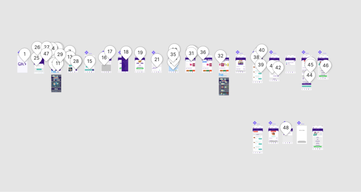
Success would be measured by demonstrating browsing behavior in screen recordings. I explored increasing items per screen, enlarging images, reducing text, and making the whole card clickable. Adding all of them together returned a design that worked beautifully, so well it created an opportunity to integrate a recommendation engine that wasn't even on the roadmap. More scrolling correlated with higher conversion, a win-win for users and business. The key insight was that user's where in browsing mode in this section, they didn't need the description, yet. But would scroll all the way down until they found something that caught their attention.

THE CHALLENGE
When Everything Needs Attention at Once
We were fast approaching the holiday season which is by far the highest season for remittances and the pressure was mounting. The holiday deadline was imminent, but years of neglected UX had to be fixed before our biggest revenue season. All previous versions of the app had limited to no UX research or usability testing, and it showed. Users were experiencing responsive issues where layouts broke on certain devices, visual hierarchy problems that buried critical actions, and usability issues that made simple tasks frustrating. The primary purple brand color displayed as a bluish hue on some devices, creating inconsistent branding. Mixpanel and Hotjar consistently showed users bouncing from certain screens.
The opportunities to improve were everywhere, which made the challenge even harder—where do you start when everything needs attention? We had one week. One week to address years of accumulated design debt before our biggest revenue opportunity of the year. Missing this window meant frustrated users during peak usage, lost transactions, and a tarnished brand experience when it mattered most. The stakes couldn't have been higher, and the timeline couldn't have been tighter.
.png)
RESOLUTION
Getting Things Done
I needed to move fast, so I sketched everything out to map the flow, then jumped into Adobe Comp on my phone to see how it'd actually look and feel on a device. Anytime I was away from my computer, I'd design on my phone, turning every spare moment into progress. The business had already scheduled user testing in other states, and the deadline was firm: one week to validate and push as much as possible into production before Christmas.
We pulled it off, but not the traditional way. I dove straight into the code to handle UI changes myself, which freed up the engineers to focus on the bigger, more complex fixes. It wasn't about perfect process or polished handoffs—it was about getting real improvements into users' hands when they needed them most. Testing stayed on schedule, critical fixes shipped before the holiday rush, and users got an experience that actually worked during our biggest season. That scrappy approach made all the difference.

DELIVER
Laying the Foundations
The changes delivered measurable results immediately. Onboarding completions jumped by 30%, users were finally getting past the privilege requests and drop-off points that had plagued the funnel. The browsing interface fixes created the scrolling and engagement behavior we'd designed for, turning a screen the business almost scrapped into an active discovery tool. We also addressed a critical gap: certain products weren't available in certain markets, and users just had to know. Fixing that visibility issue reduced confusion and support burden.
But the longer-term impact was even more significant. The UI foundation we built opened the door for expansion, the company grew from operating in one country to three markets while I was there. What started as a scramble to fix years of neglected UX became the foundation for sustainable growth. The design thinking workshop, the guerrilla research approach, the battle-tested prototype, all of it proved that investing in users and giving design a strategic voice wasn't just good practice. It was good business.


TAKEAWAYS
The Power of Bringing People Together
The design thinking workshop was one of the best moves we made. It captured all the ideas people had been holding onto and brought down silos for a few days, creating a forum where those ideas could actually turn into something. Being part of that process, watching stakeholders from across the company collaborate and align around the user, reinforced how powerful it is when design facilitates that kind of conversation. It speeds up the entire design process afterward because everyone's already invested. It's also a great way for design to have a real voice in an organization, not just as executors but as strategic partners shaping direction.
This project taught me how easy it is to be data-led and still user-blind. You can have all the quantitative metrics in the world (click rates, bounce rates, conversion funnels) and still miss what's actually happening. Data tells you what is happening, but it doesn't tell you why or show you the frustration on someone's face when they can't figure out your interface. The best approach is informing one with the other. Guerrilla testing brought context that numbers couldn't provide, and those user recordings changed how the entire organization thought about the product. That's the lesson I carry forward: data and user research aren't opposing forces. They're incomplete without each other.


