

ROLE
User Experience Designer / UI Developer
INDUSTRY
Freight Brokerage, Logistics
WORKED ON
Design System, Design Workshops, Front-End Development, Design System Evangelization
IMPACT
What Changed
Improved design consistency
Created a more cohesive and intuitive user experience across the entire platform by establishing consistent design patterns.
Cut UI delivery time in half
Reduced UI feature delivery from 4 weeks down to 1-2 weeks by designing and coding 30+ components from scratch. Components reflected decisions made over team meetings, best practices, prototypes and consensus.
Enabled Developer autonomy
Gave developers a fast track for building UIs with prebuilt, tested components they could trust and implement immediately without design handoff delays.
.gif)
DISCOVERY
Multiple apps. Multiple frameworks. Multiple variations.
A transportation management system for a freight brokerage, built a unique architecture that allowed for fast deployment of new features. Micro frontends paired with micro services, was an extremely good way of allowing developers to spin up apps, and dive right in to build the features our users needed; it worked and made things faster and easier to debug. Updates in the programming language and framework, created many solutions to the rendering of front end elements.
The cracks were showing everywhere. A component inventory analysis revealed we had multiple versions of the same components scattered across applications; dropdown's that looked different, buttons that behaved inconsistently, forms that followed different patterns. Users felt it too. In research sessions, they'd pause mid-task, confused when a components pattern suddenly shifted between workflows, and worse they had gotten used to it.
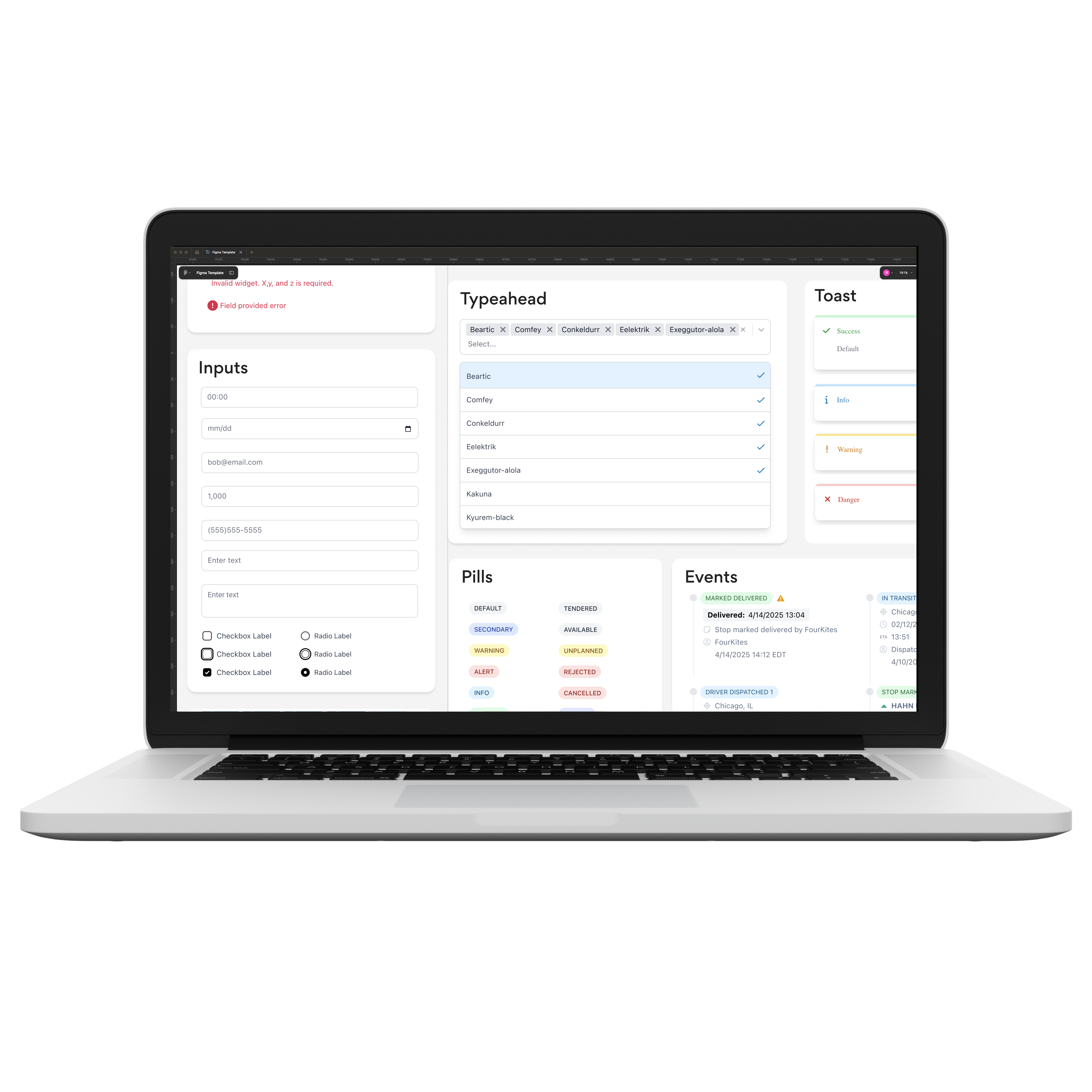
One of the easiest examples of this issue was with select_input. There where a lot of variations of the same interface pattern across the app.
Developers painted an equally frustrating picture. They were spending time recreating UI elements instead of building features, navigating a complex tech stack of CSS, Tailwind, Bootstrap, Vue.js, Slime and Phoenix LiveView. The rapid evolution of Phoenix LiveView had left technical debt in its wake, and without consistency standards, the design team was unknowingly making things worse, designing the next new interface, without addressing the previous ones. This wasn't just an inconvenience, it was starting to show.
I partnered with a lot of kind-hearted people to work on this, early on it was something I would research in between projects. After the initiative got approved, It then evolved to where it was 1 or 2 designers and myself, working on this at any given time. Many folks had built previous component libraries, with the hopes of solving this issue, a lot of what they learned saved us countless hours of pain, and also helped inform us as to what else was missing to pull this off.
DEFINE
Front loading team decisions
If we wanted to solve this issue, we needed to build a proof of concept, and I'd learned the hard way that the best ideas come from front loading all considerations early in the project. Unprepared critique, kills momentum. So I created a workshop format and facilitated sessions with designers and developers, virtually and asynchronously, to capture different perspectives before we committed to anything.
Four designers and eight developers weighed in, and those conversations shaped everything that followed, as each component from now on would follow the workshop template. I realized that the complexity of the issue, was more than I could understand at the time; but other folks already had some of the puzzle pieces figured out. This project needed their insights.
.png)
Talking to developers, about what a proof of concept would be, a good starting point we all agreed on a component that could tackle the most apps in the current environment. From there a good idea was to start with the easiest ones like <text_input/> and <time_input/> before tackling the more complex components like <multi_typeahead/> and <search_select/>.
We studied existing systems like PETAL components and Daisy UI, but off-the-shelf solutions didn't fit our Phoenix LiveView architecture, and dependency tech debt. We needed something closer to core_components for maximum compatibility with our microfrontend stack.
%201.png)
One developer explored building custom scoped CSS, which would've kept the component's CSS files beautifully contained in one place, but we ultimately chose Tailwind for its flexibility and team familiarity. To his credit, a few years later with LiveView 1.1, Collocated Hooks did a lot of the stuff that this brilliant dev had figured out!
DEVELOP
Building momentum
Early technical mistakes forced us into better solutions we wouldn't have found otherwise. The initial components I built were heavy in JavaScript, using phx-update=ignore to maintain state—which seemed clever until production revealed bugs everywhere. I had to rewrite everything as LiveComponents, and honestly, it hurt. But the rewritten components were more robust, more maintainable, and actually better for it.
Sometimes you have to build it wrong to understand what right looks like. Over many iterations the Kitt design system became: many component workshops, a design process, A component library, a Figma library, a service for product teams and a practice to ship better UI's.
The design team met twice a week to review component work, and these conversations, helped inform opportunities to plug in new components. Those reviews pushed each component to its best version before production. We pushed for a storybook-like documentation site so developers could test components, which accelerated everything, another developer had cracked that code, and that let us build components in isolation.
In the early days, proving the concept meant getting to code as quickly as possible. So I developed first in storybook, then designed in Figma—proving the concept worked mattered more than pixel perfection. As a side effect of doing that, over building out the Figma library first, I started bumping dependency versions across apps and gutting old dependencies where I could, which improved the apps overall.
Teams began coming to us asking for components, and the best feeling was telling them we already had something ready to use, or almost there yet for their consumption.
THE CHALLENGE
"Without adoption, the system would die"
There was a chicken and egg scenario we kept running into.
Developers wouldn't adopt the design system until they saw it succeed. This wasn't their first rodeo, previous attempts at a design system had failed, and the team remembered. Developers were cautiously watching, waiting to see if Kitt would survive long enough to be worth their investment. Some were straightforward about it: they didn't want to use the components. We'd built on the work that others had pioneered, but we'd hit the same wall that had stopped them.
The resistance made sense when you understood the context. Developers had gotten used to building their own way, carving out workflows that worked for them in the micro front-end landscape. They were acutely aware of the technical debt piling up in some apps, but addressing it directly felt like too large a lift. Asking them to adopt Kitt meant asking them to change their habits, trust an unproven system, and take on risk in an environment where previous design system efforts had quietly died. That's a hard sell.
RESOLUTION
Removing barriers
The answer wasn't to wait for adoption, it was to remove every barrier. We deployed the component library across as many apps as we could and started replacing existing components with Kitt versions ourselves. I framed the design system strategically to other teams: it was like an interstate highway for our microfrontend architecture, we had the infrastructure, and where keeping apps up to date to support it. Any component that needed to live in multiple apps would benefit from starting on our library instead of being rebuilt in every application. That resonated with developers who were tired of reinventing the wheel.
We also grew the library tastefully, starting with form inputs and display elements like labels, errors, and flash messages, avoiding anything too context-specific early on. Along with our semi-weekly feedback meetings with designers, to come together and learn about what they where working on, we captured current or future needs and turned them into components. We knew that without constant input, adoption would stall, so we leaned into it, reducing anxiety around new components by keeping communication open.
We marketed relentlessly. If there was an opportunity to mention Kitt in a meeting, Slack conversation or demo new components, we took it. We even held an open house presentation for the entire office, not just developers, revealing the inner workings and the why behind what we were building.
DELIVER
From a skeptical experiment to a production improvement
Kitt transformed from a skeptical experiment into a production improvement. As a result it sped up development, improved visual consistency, and helped keep apps up to date. Developers started coming to us with requests for their particular use cases, and when we could take an existing component and create a variant, the reception was enthusiastic. It made it possible to build more things simultaneously, our team was helping multiple projects at once, and we had a system to deliver components quickly.
The apps themselves started becoming more consistent. Those jarring differences between applications were finally being addressed, and the platform began to feel cohesive in a way it never had before. But Kitt's impact went beyond solving today's problems, it opened up future possibilities. The system became the inspiration for a potential next step: bringing all front ends into one new unified client and further reducing the frontend complexity. What started as a proof of concept to fix inconsistency had become the inspiration for how we could evolve front end development.
TAKEAWAYS
What I learned
I wish I'd built a working proof of concept before those early organizational conversations. Selling abstract ideas is hard. Having something functional to demonstrate would've accelerated those discussions and made the value proposition immediately apparent. People need a frame of reference, and showing beats telling every time.
Working on Kitt taught me that design systems aren't just about craft, they're about change in an organization. That can be tough and exhausting. The evangelization, the persistence, the constant communication, all of it reinforced that making meaningful change requires as much organizational awareness as design skill. You're not just building components; you're changing how people work, and that means navigating resistance, building trust, and staying committed even when adoption feels slow. It's worth it, but don't underestimate the human side of systems work.
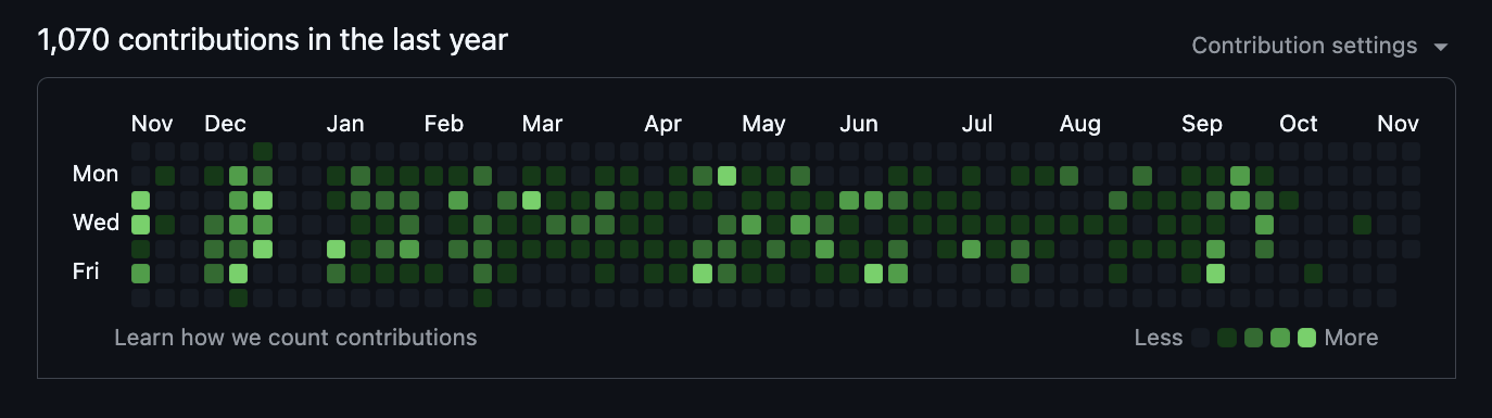
Picking up Phoenix LiveView, and becoming proficient at it, took time. I'm glad I did that, so that I could better understand the pain points developers dealt with. It helped bridge the communication between design and engineering; and made for better components because of it. The green squares also look pretty nice.


