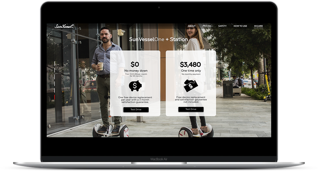
SunVessel Landing Page

A high fidelity prototype of a marketing funnel landing page.
The current website has an inquiry page that is a fillable form. The Client would like to create a meaningful experience around it that ties in with other marketing activities.
A survey was conducted about the use of hoverboards. A Survey canvas was used to build the survey questions.
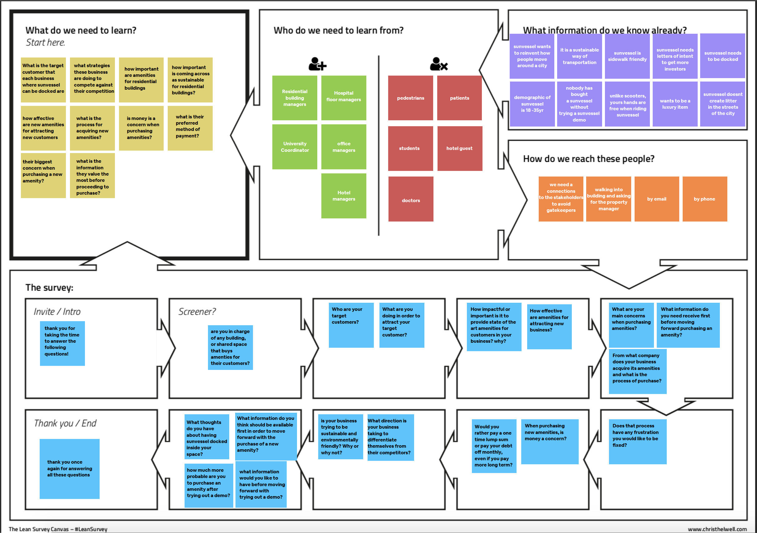
54 respondents provided the team with surveys. Some of the key findings where:
The significance of this was that one of underlying assumptions was that hoverboards where for a younger demographic, the survey demonstrated that there was an untapped market the company was not addressing.
At the same time 5 interviewers with prospective clients helped the team uncover more insights:
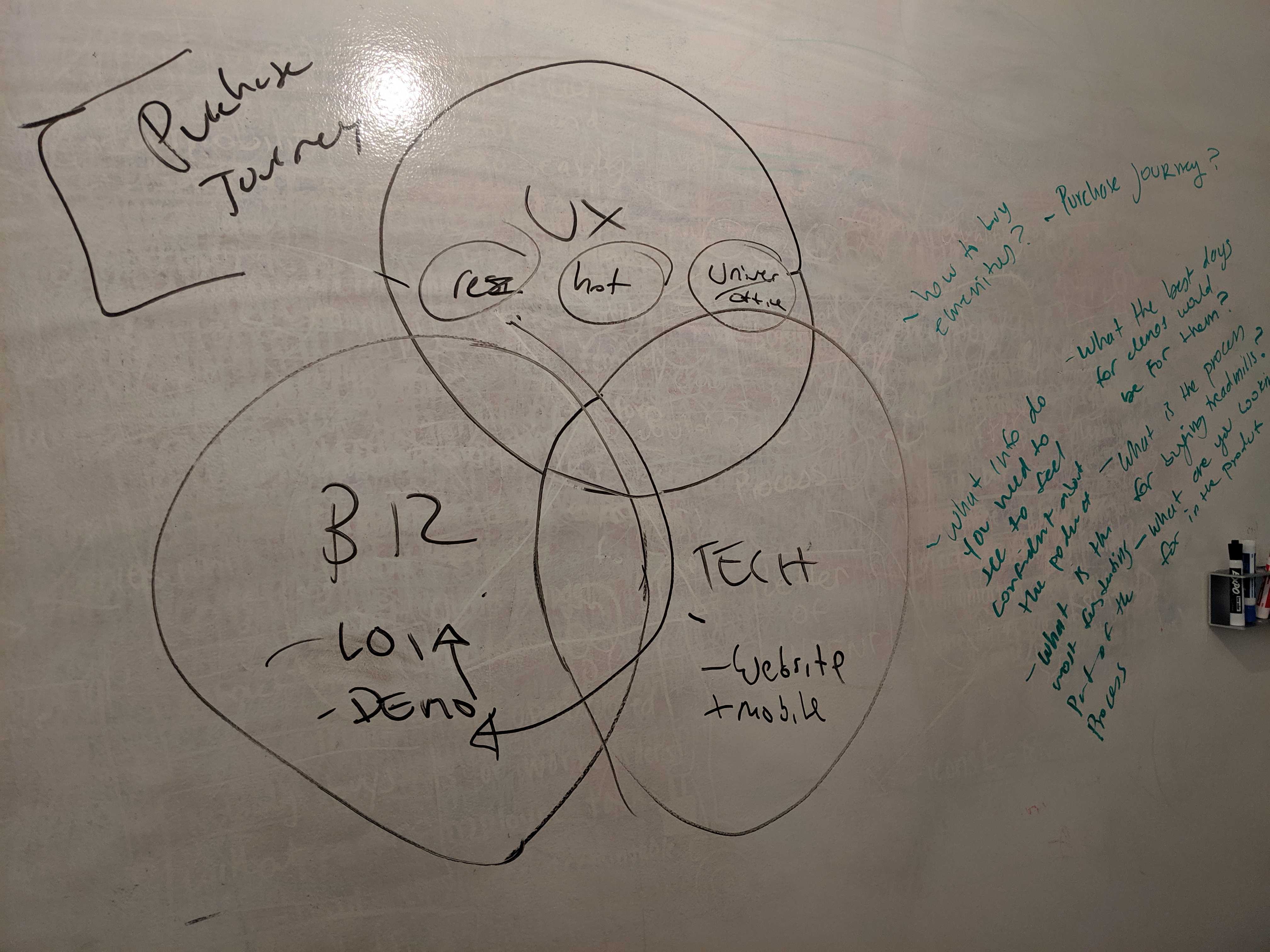
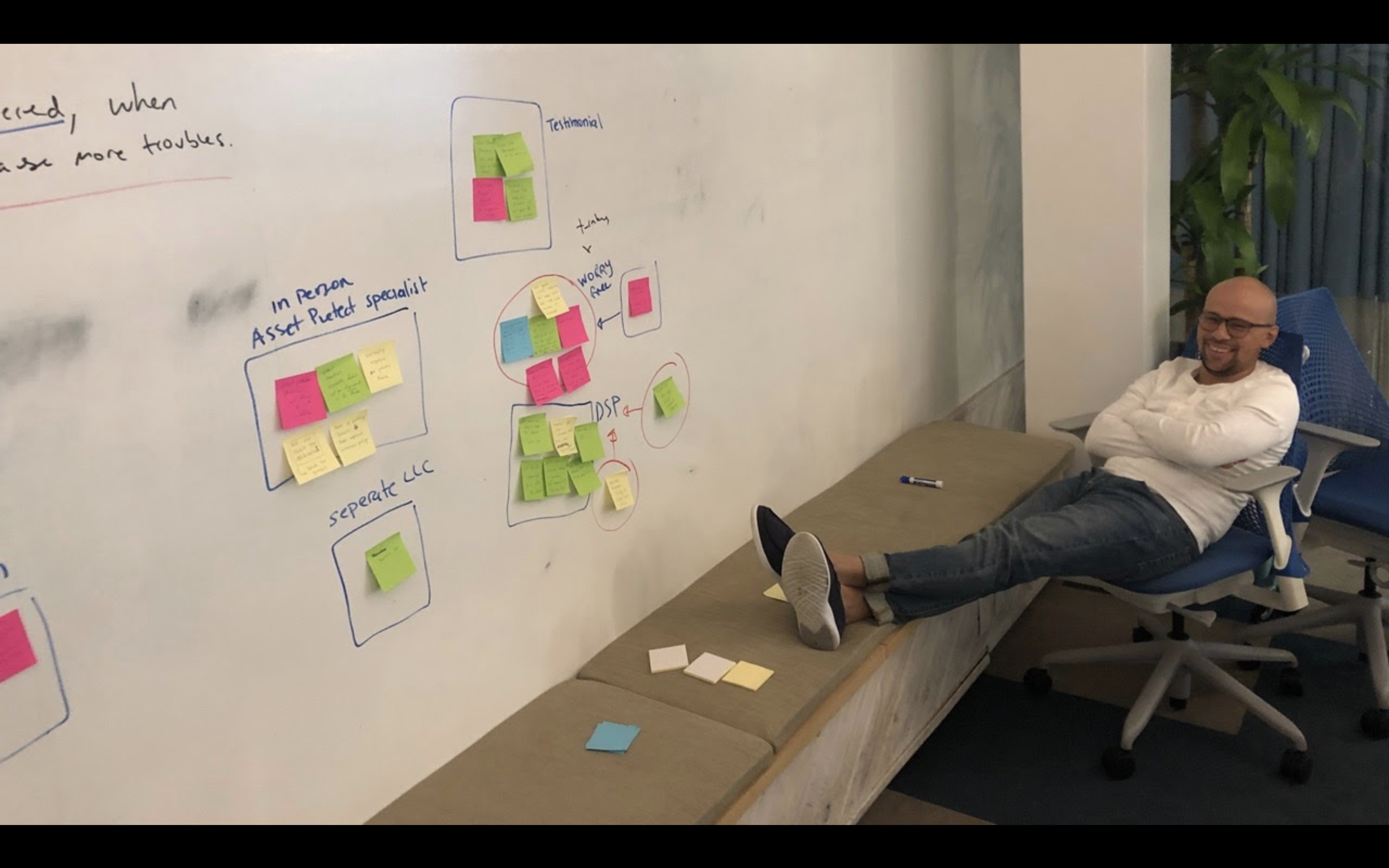
A lot of time was spent with a whiteboard looking at all the data from the research.
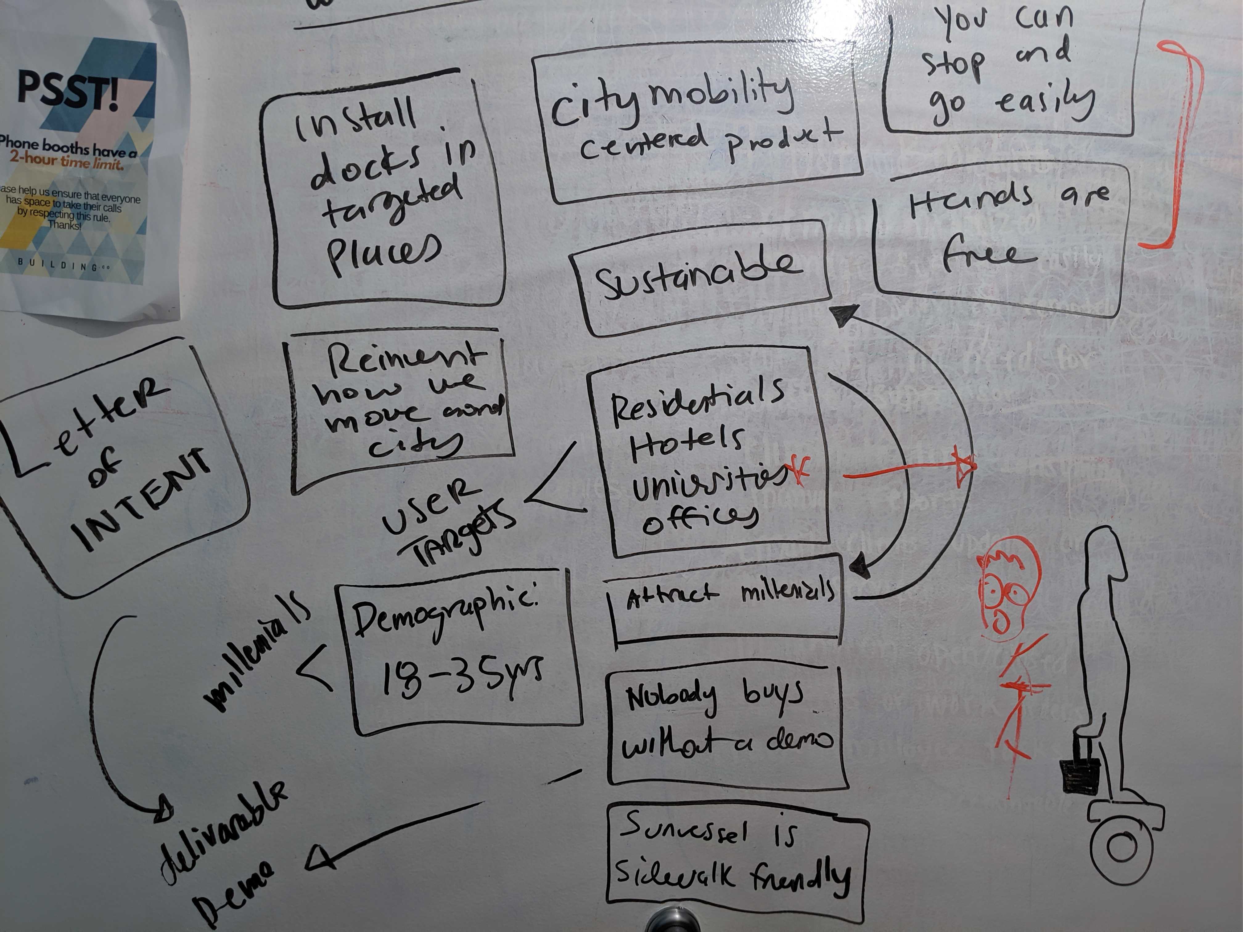
At the same time we had to look at the context of the product in terms of what the business was doing. So I took out a few pages from my marketing playbook as a high level map of the product expectations.

This mix of User Feedback, Business Logic and Technical Feasibility kept the project honed in on what we needed to do.
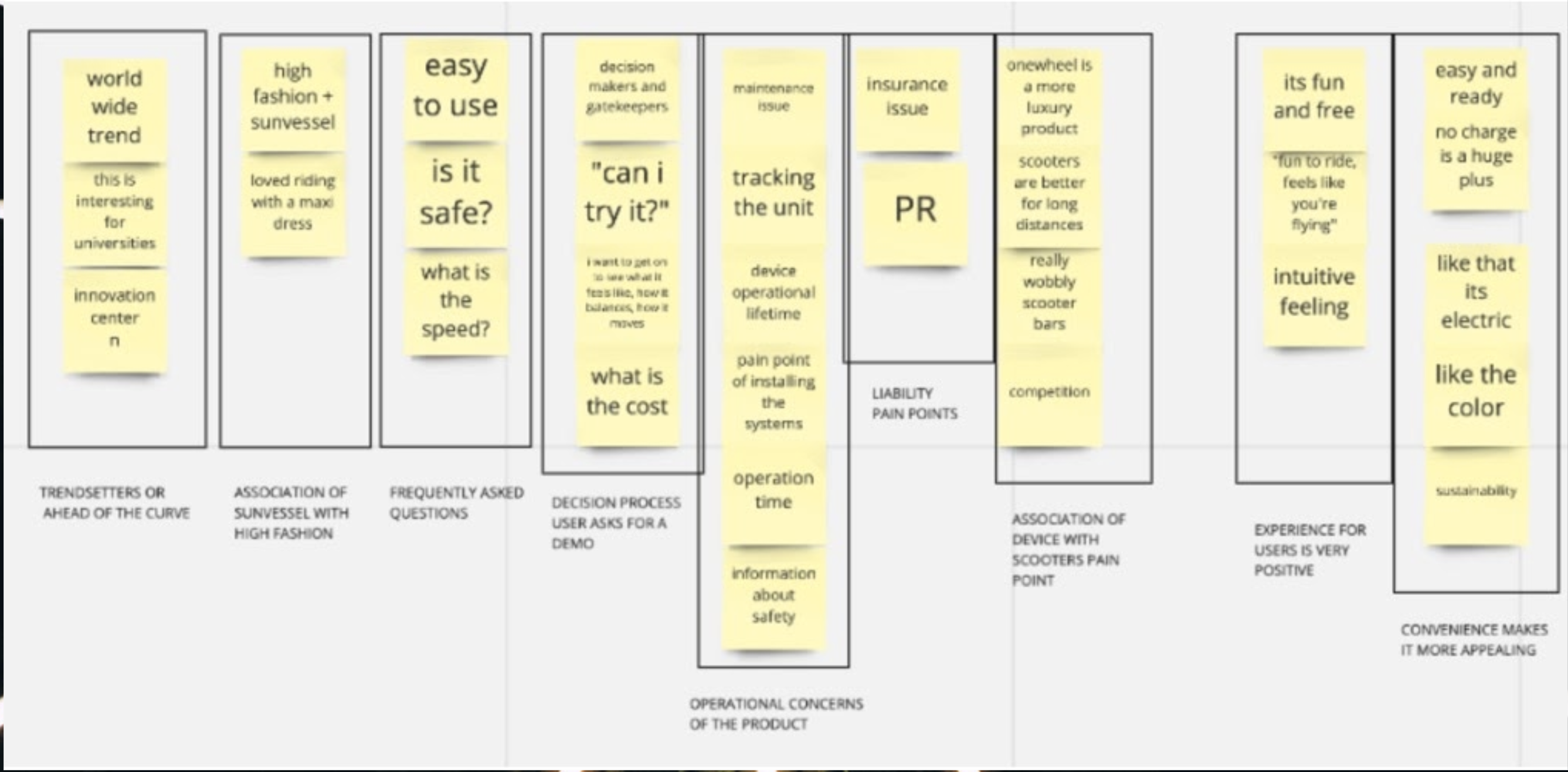
An affinity map helped find the reoccurring patterns and themes in the data.
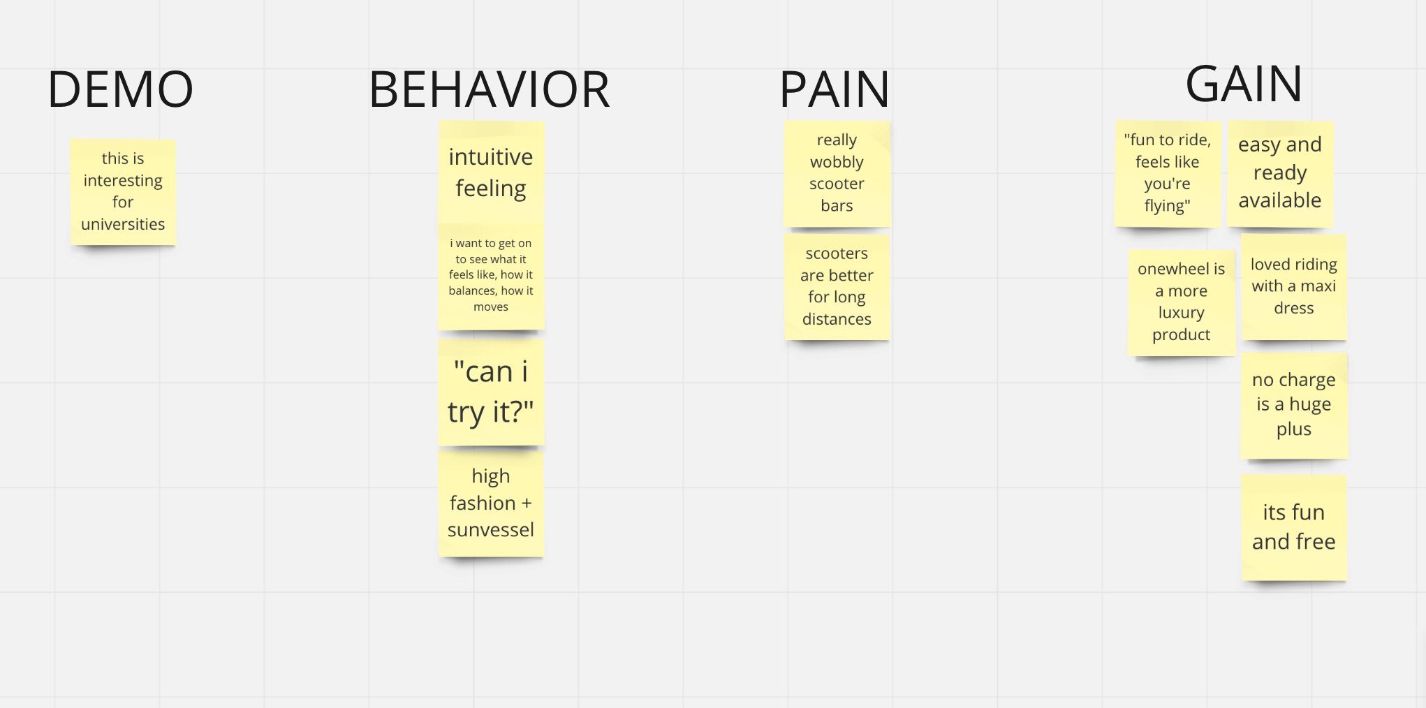
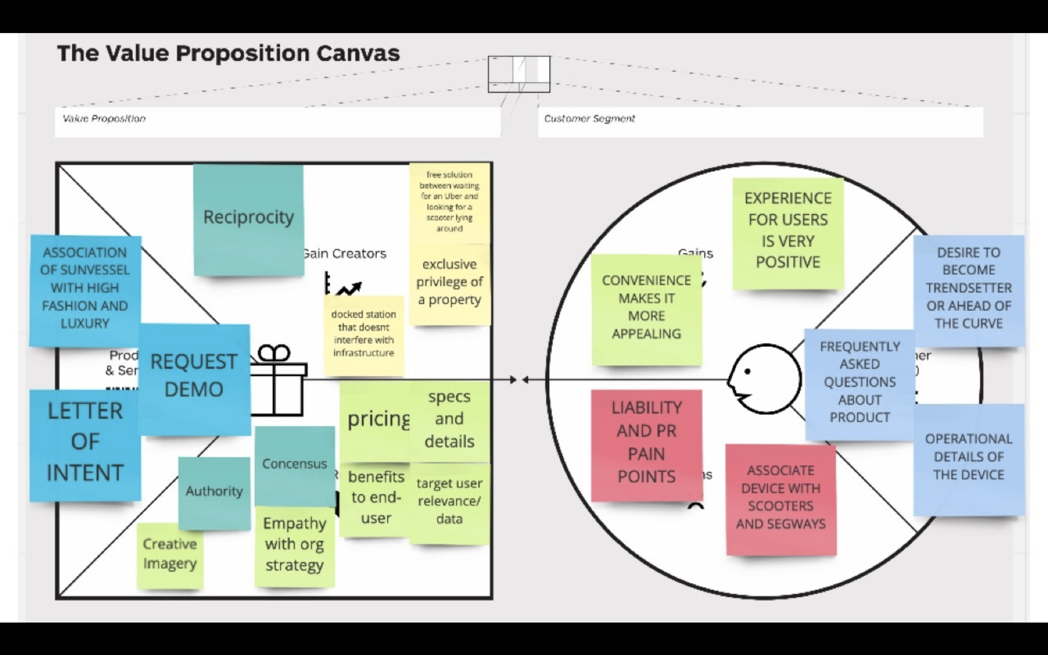
The Value Proposition Canvas helped map how user pains and gains would be tackled by the business.
The assumptions we started off with, where that the demographics for hoverboards tended to lean towards millennials. This was shattered by the research where we found that the average user age was much older.
The constraints we had was integration with an application for appointment scheduled that the Client was already using.
Although the end-user would be someone else, we defined our main user as the one with purchase power that would navigate the site.

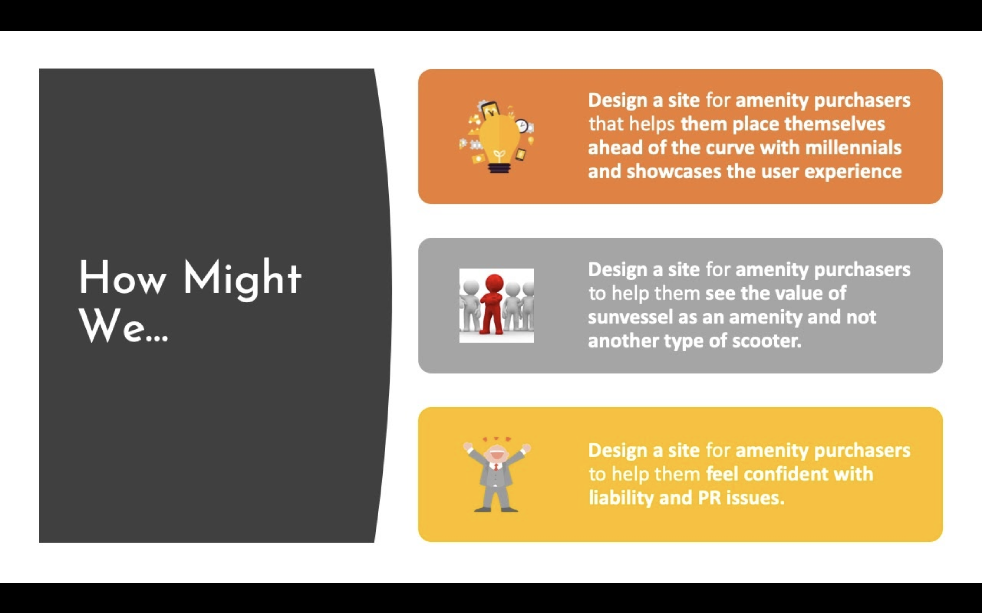
We could now define the main focus of the product.
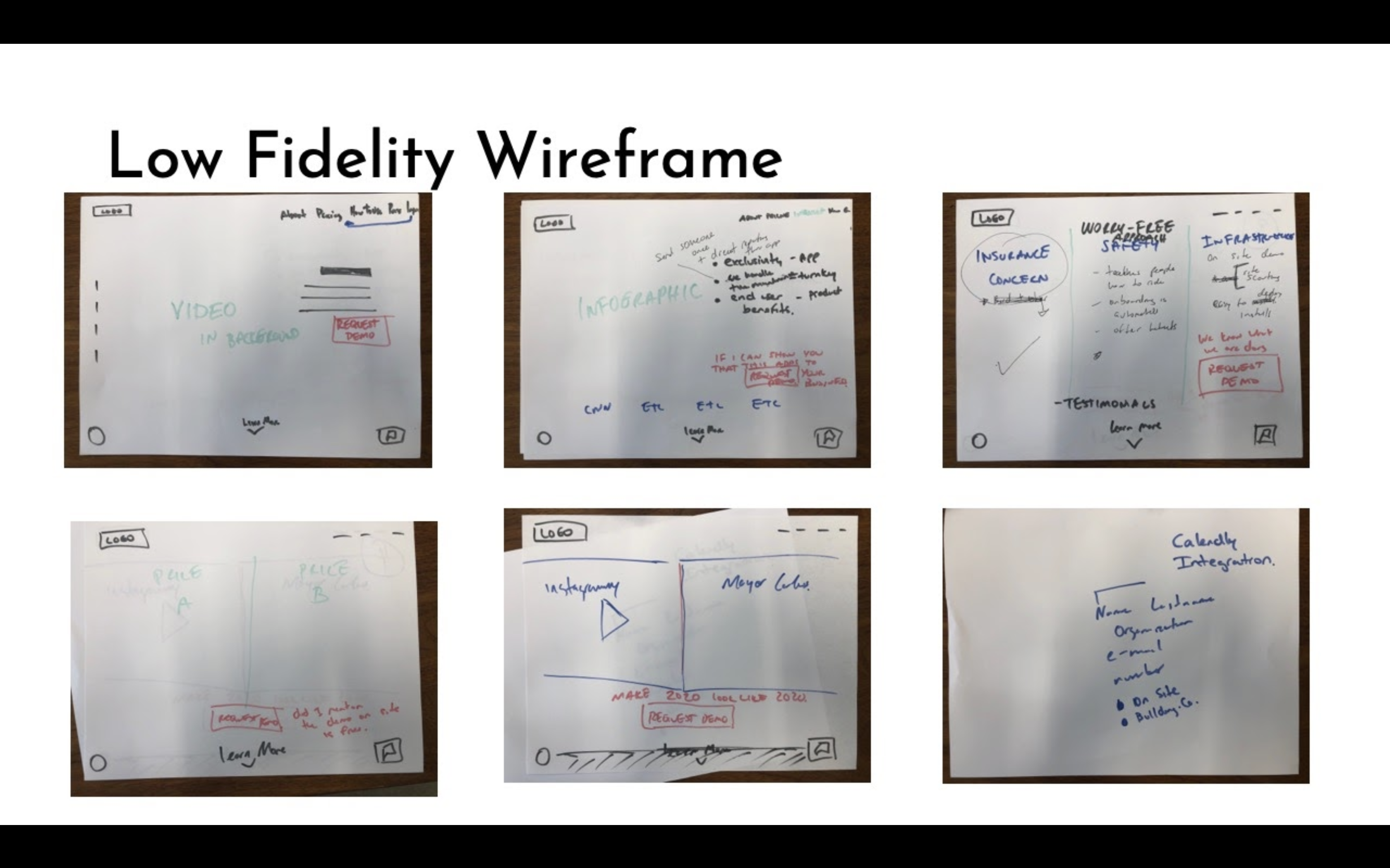
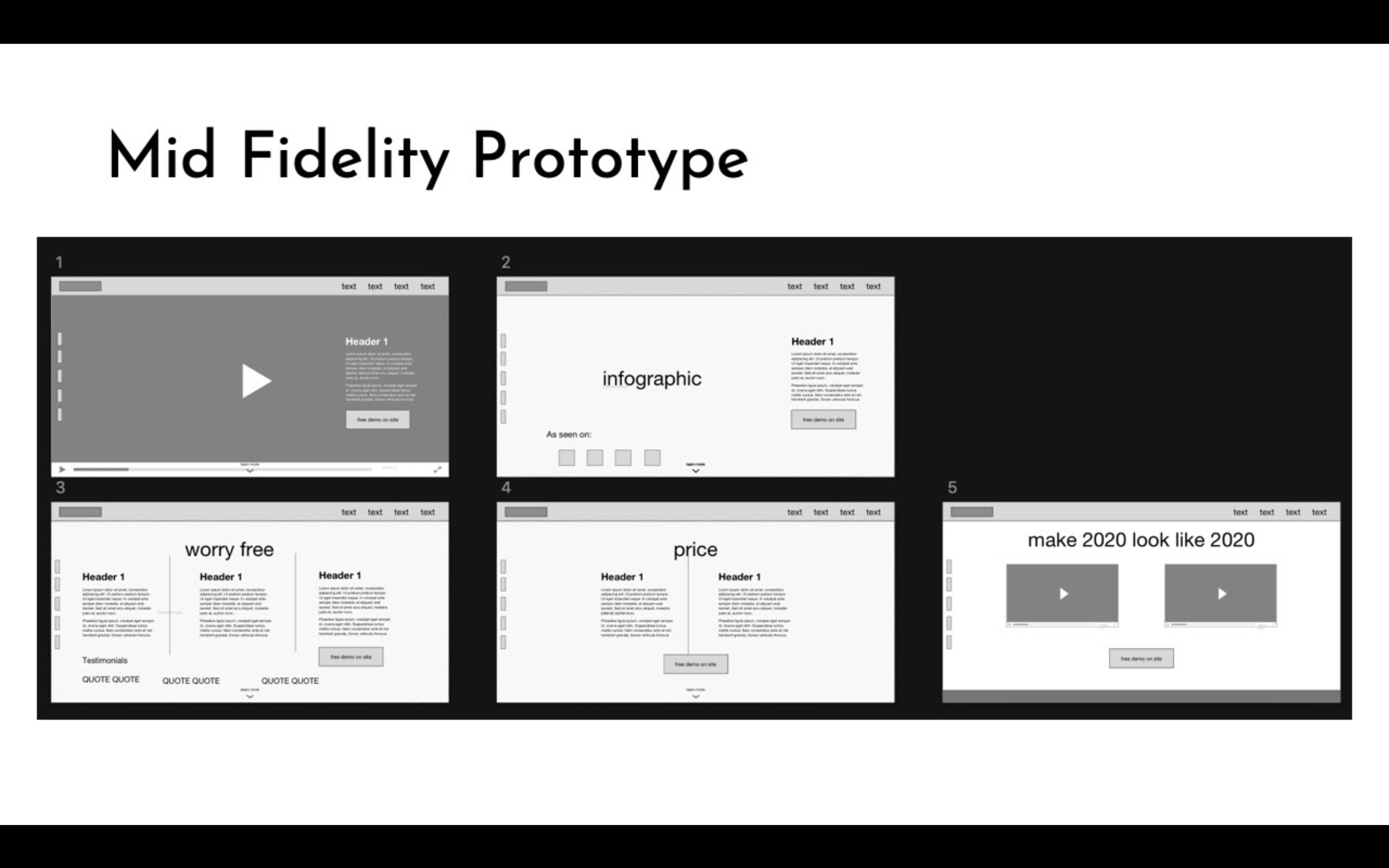
At this stage coming up with alternatives and solutions began to be individual as the team could now tackle the sprint phase and have three separate versions for the Client.
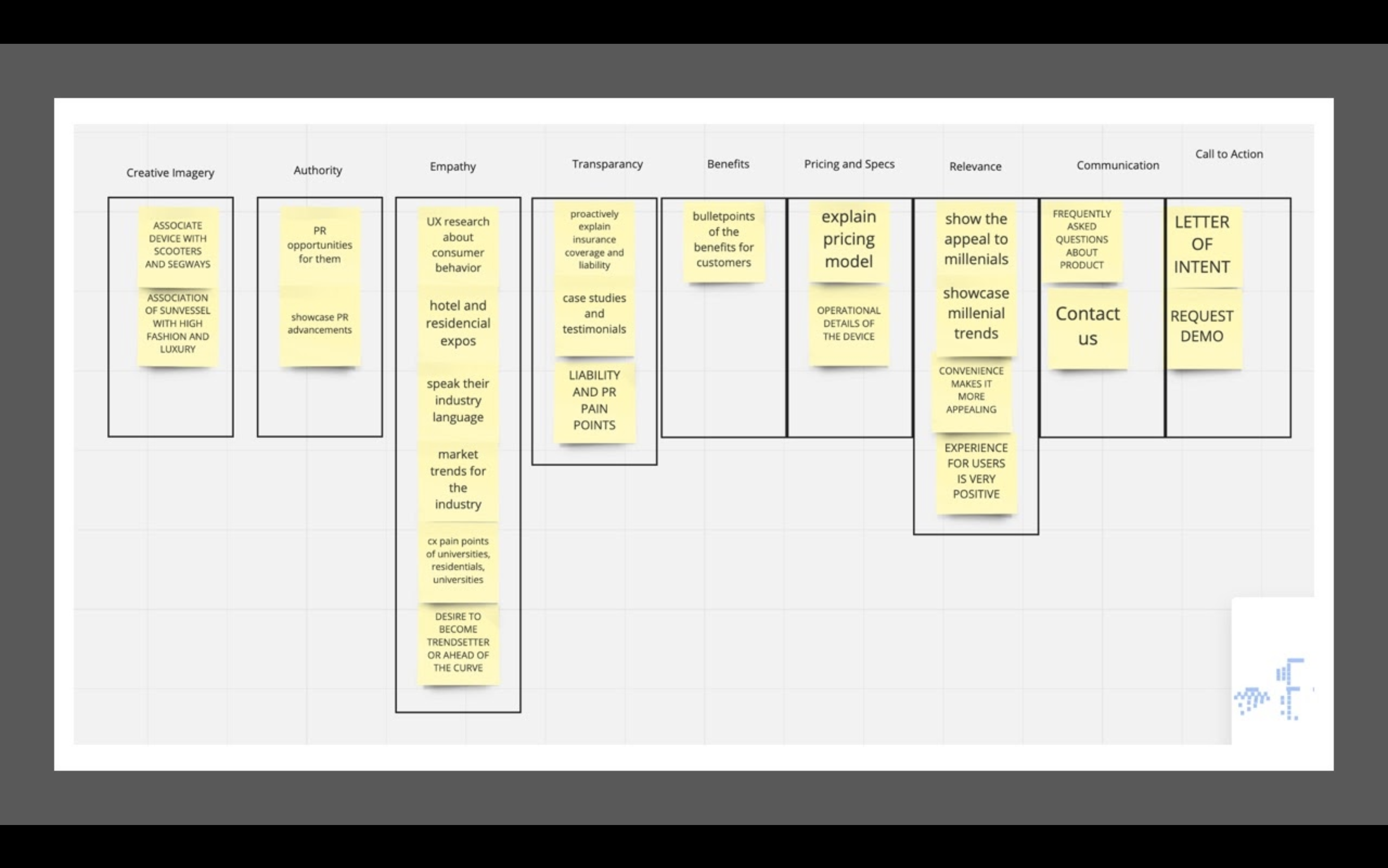
The list of ideas, was then grouped into themes.
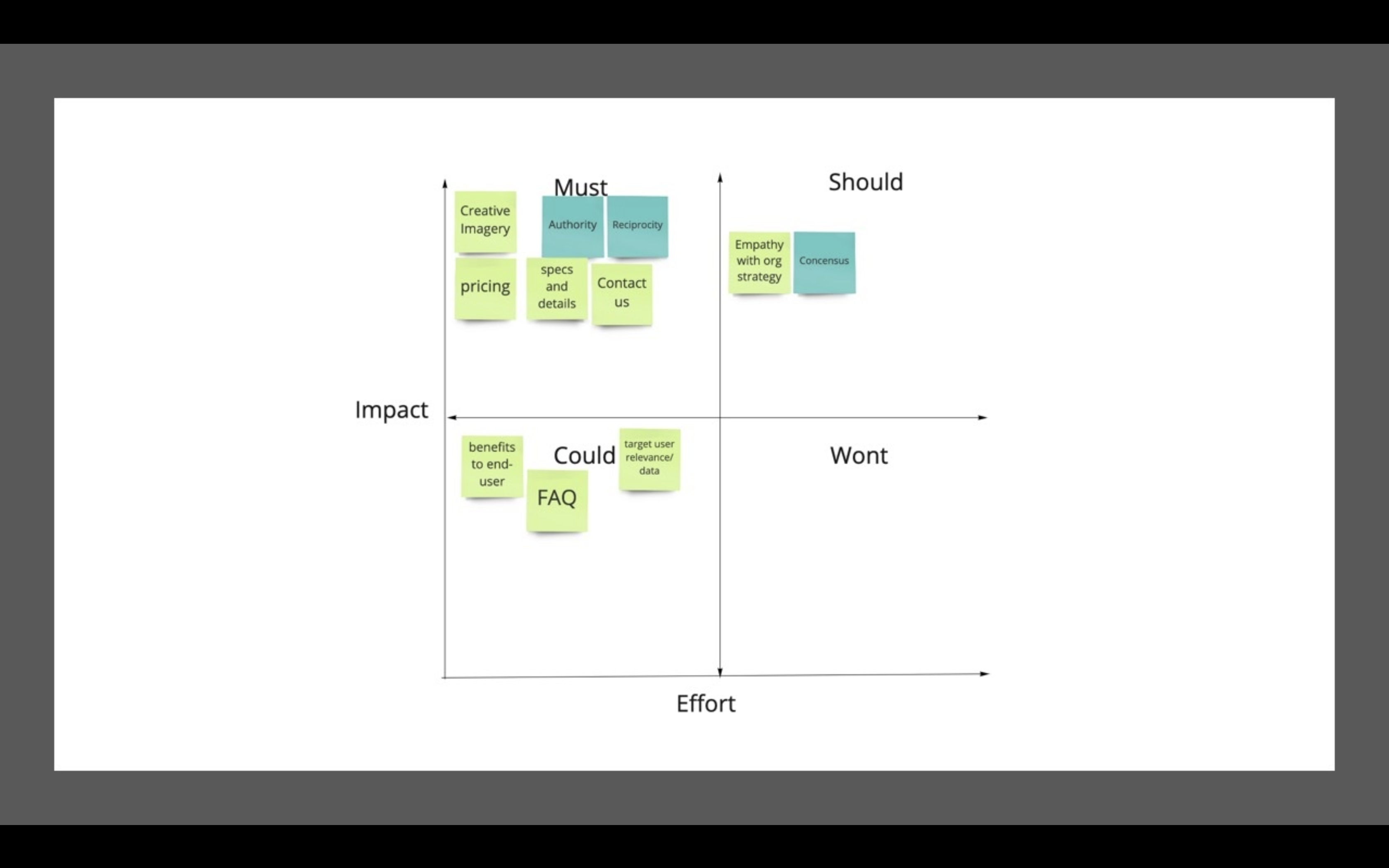
In order to cut down on the tasks and focus on the most impactful features I used the MoSCoW method of feature prioritization.
At the time I had discovered how to use User stories, to describe features and components in the UI. This way I could tackle what the product needed to do on the Epic level, with these simple user stories.

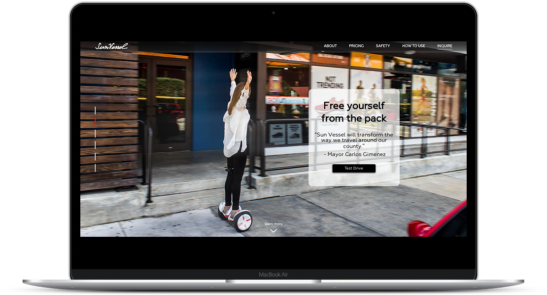
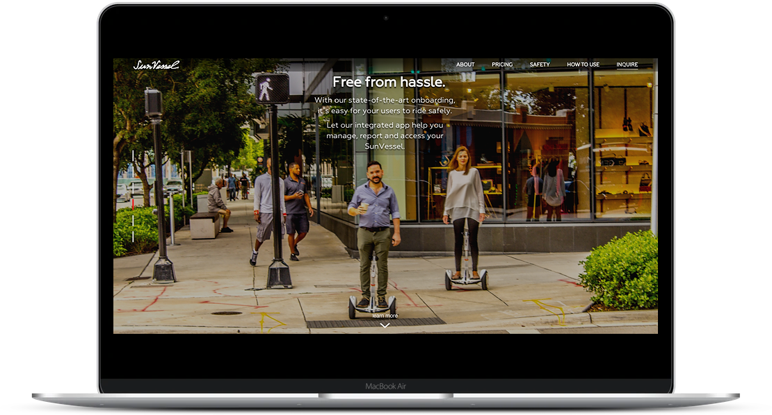
Now it was time to bring the insights from the UX into the UI. By this point the CTA for the entire website was 'Request Demos' and an Inquiry page as a tab could affect prospective users from the call to action. Instead the plan became to place the CTA on the home page.
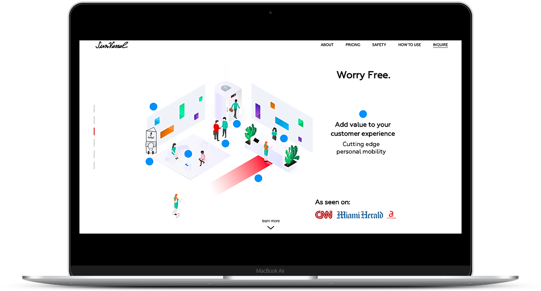
I kept the navigation familiar with same slide format as the original.
The new direction was accepted by the Client.
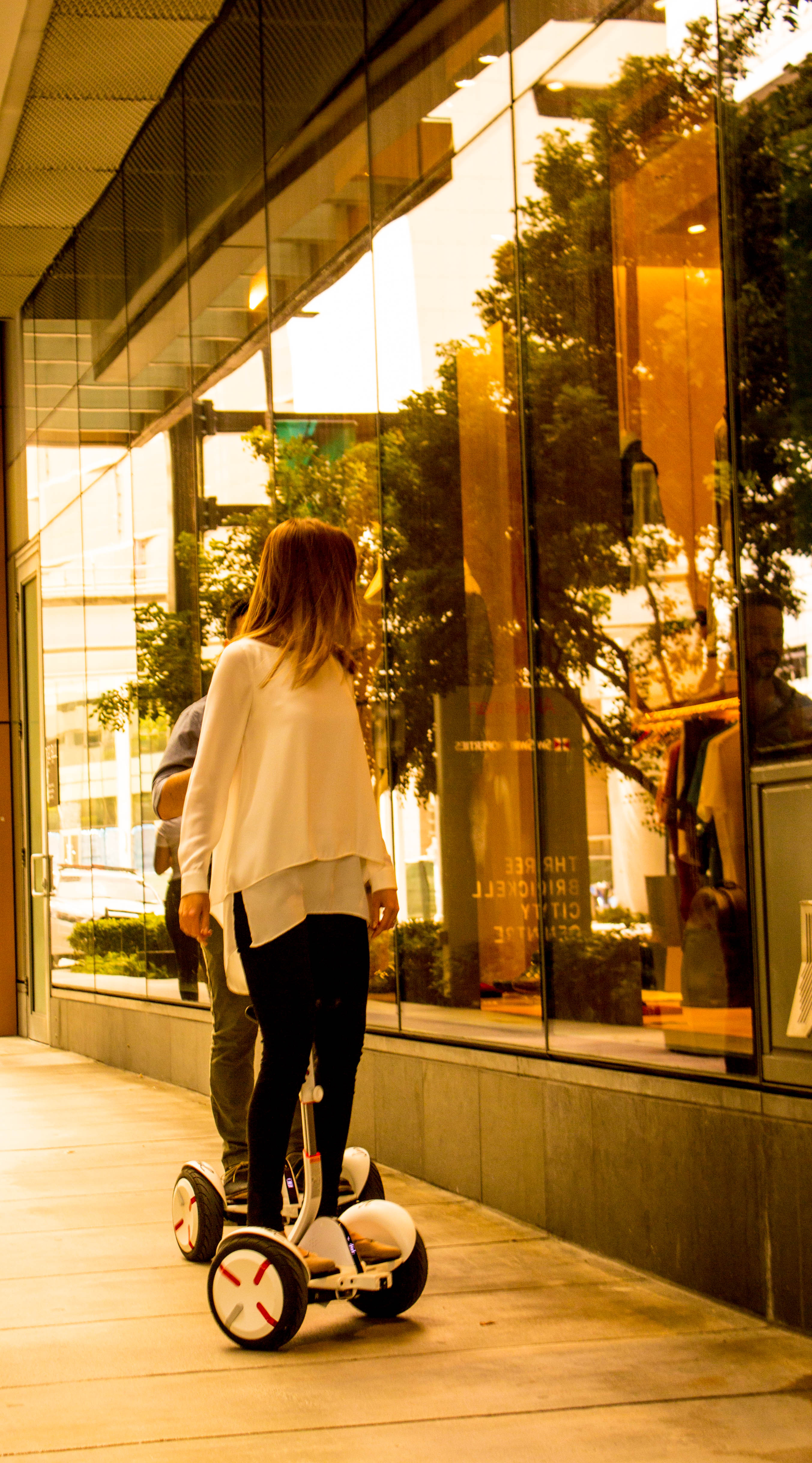
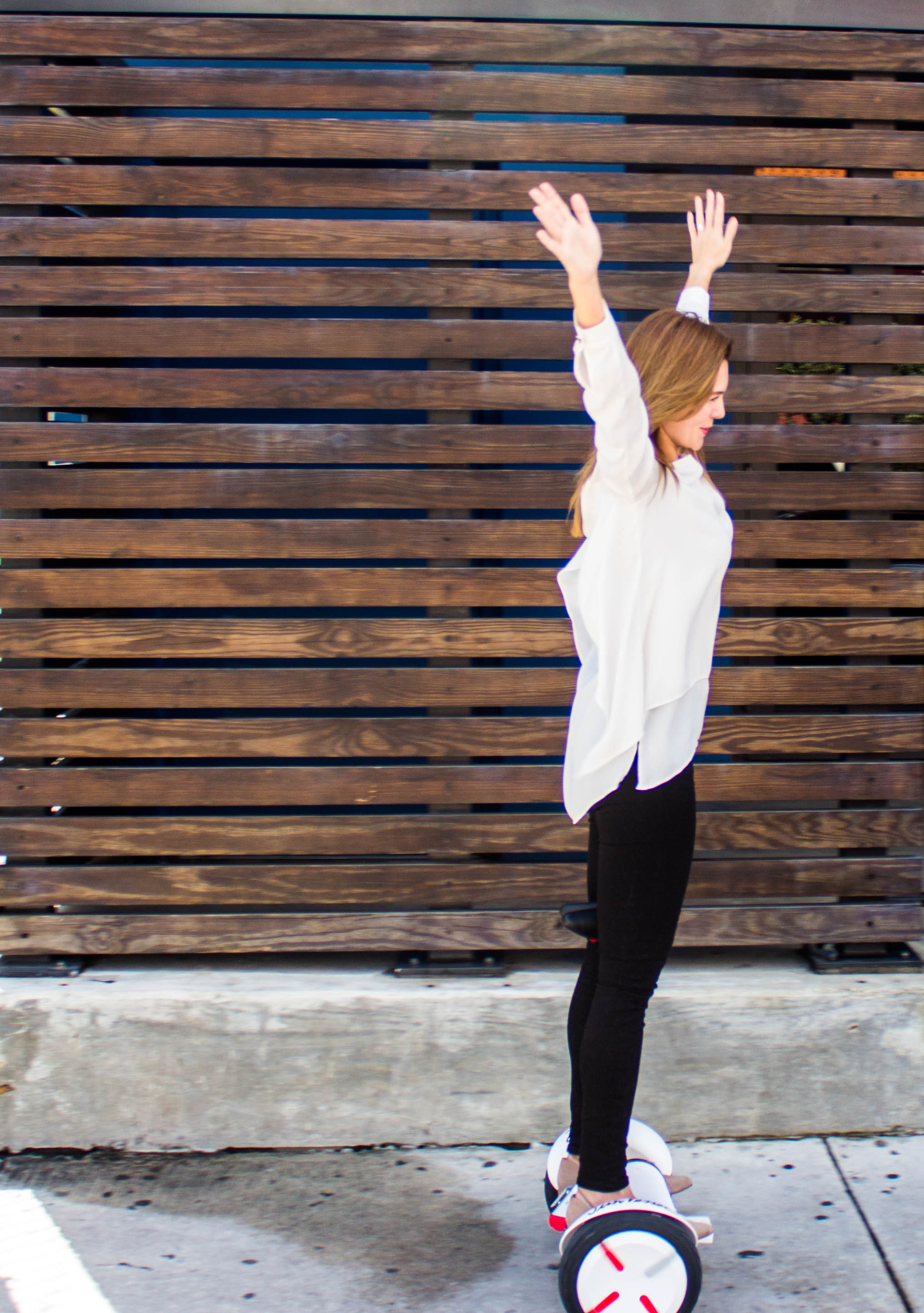
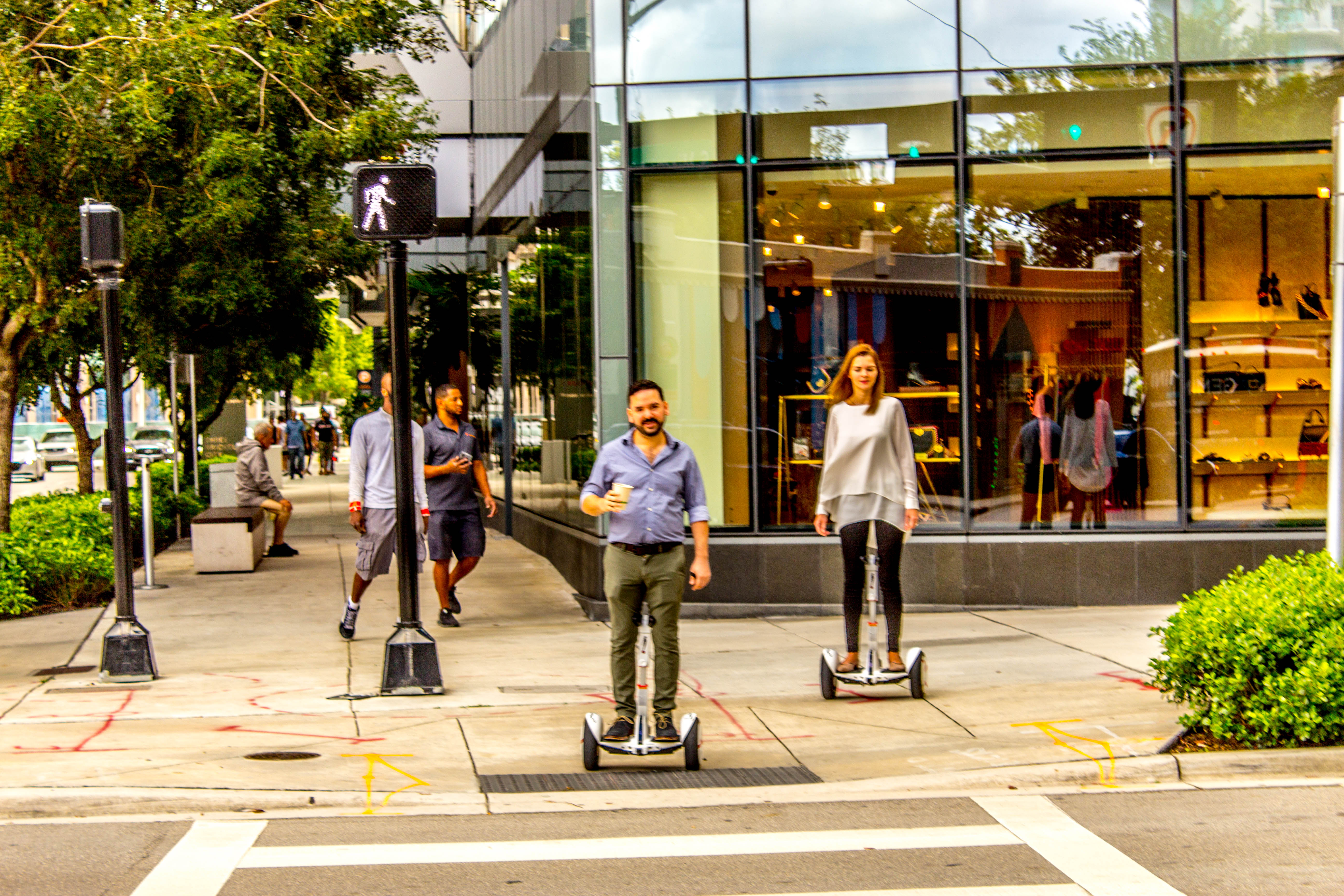
This last part was really fun. I took out my camera and with the help of the team we created some really nice content for the company.
I took the wireframes into Sketch and started laying out the design and working out the User Interface.
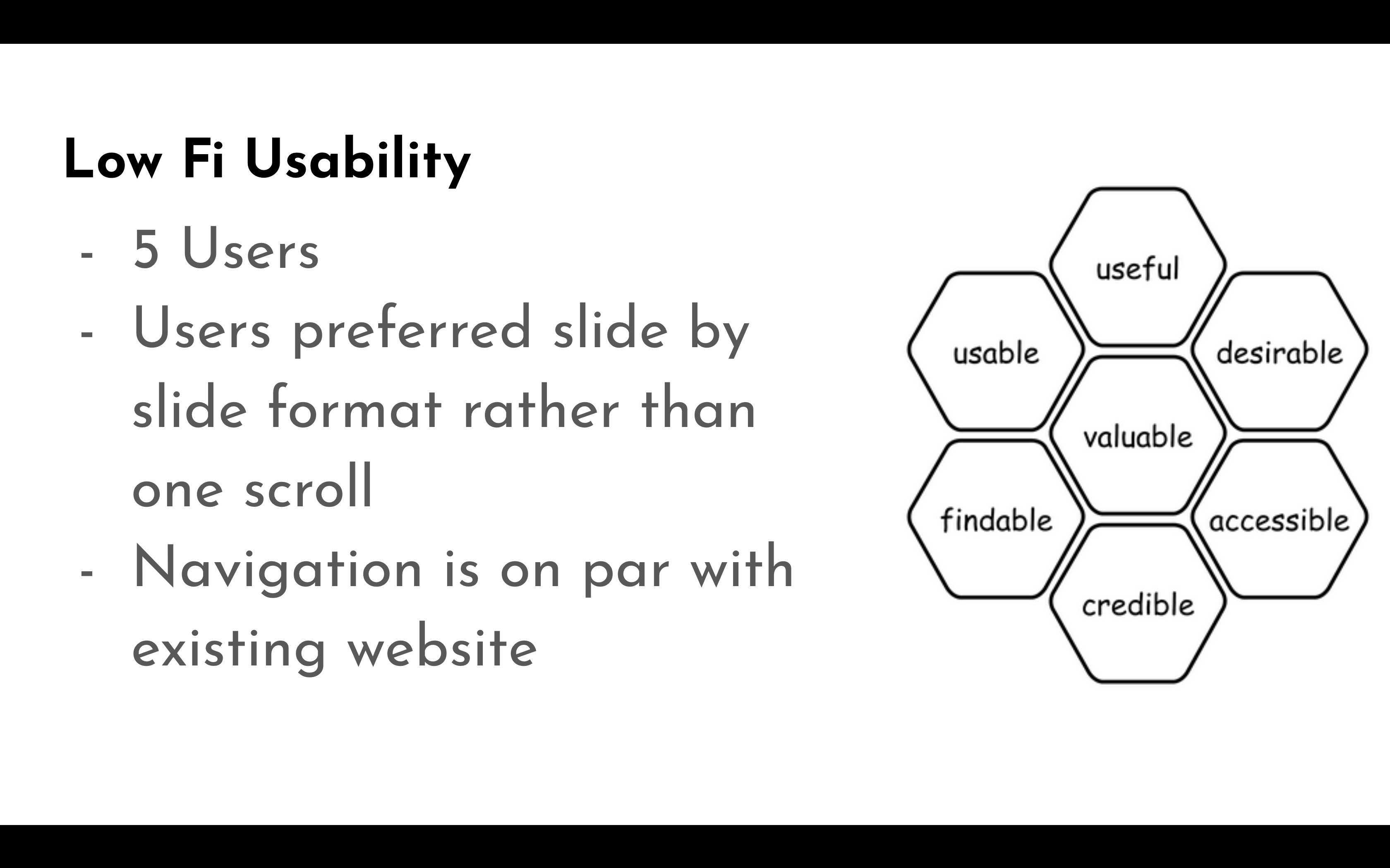
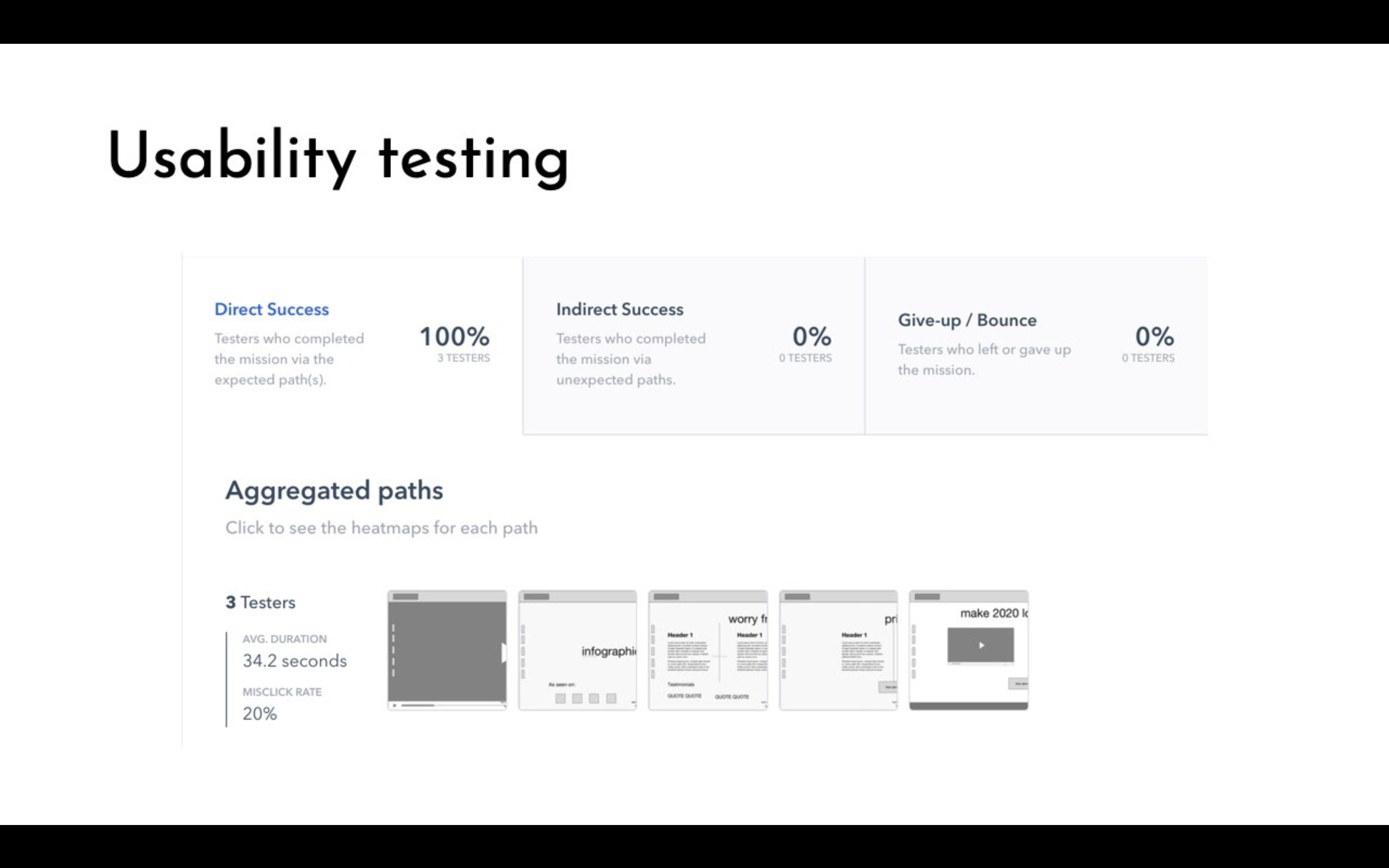
With three testers I was able to see if a user would be able to use the site as intended.
From the new stock footage, I created a moodboard to start getting an idea of how to mix high end hoverboards with high end fashion.

I went a little further and investigated what would be the target audience size if the Client would add a digital marketing strategy to bring traffic to the site. However, those details i'm not at liberty to discuss. That is why there are some ad images in the product video.
I'm very glad to have gotten to work on this project, it involved a little bit of everything to create the final product.
