Drayage Application

An organized driver and load matching tool for dispatchers.
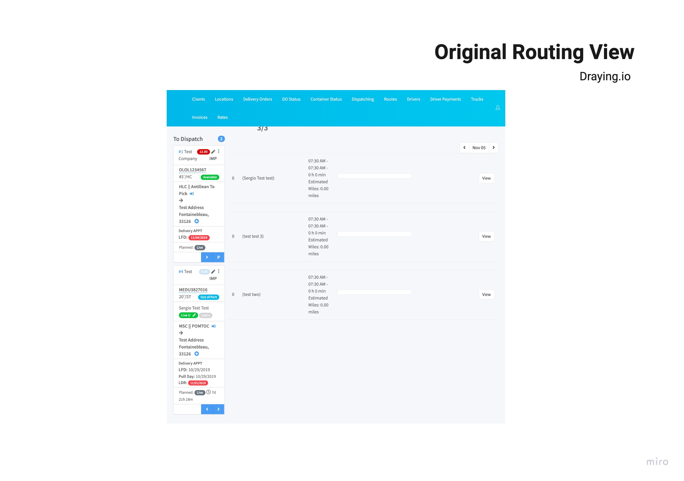
The tool had two screens that performed similar yet different processes. The client was interested in merging both screens into one; so that a dispatcher could perform all tasks in the same view.
.png)
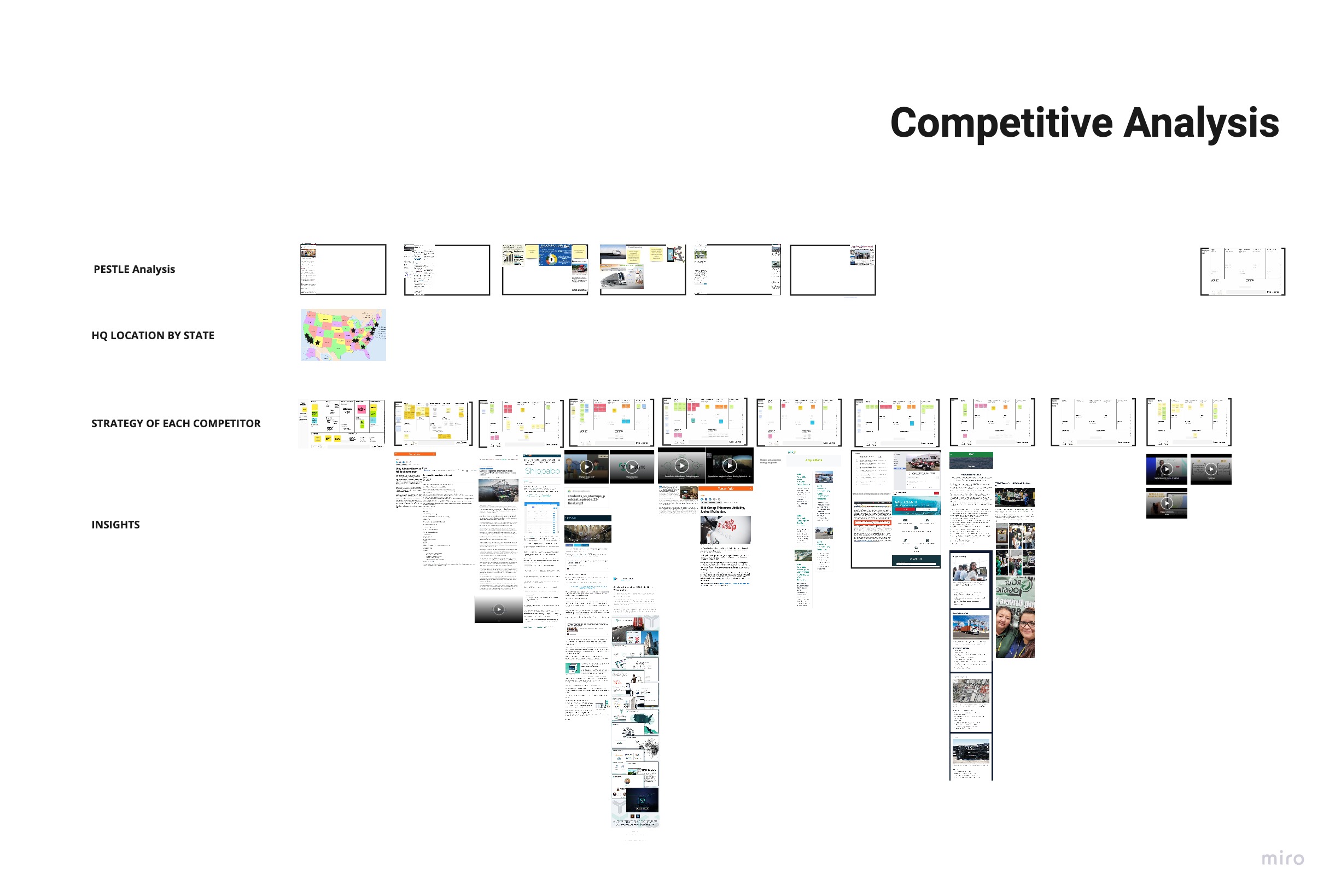
While undergoing product onboarding, I began running competitive and industry analysis, to understand the high level context in which the product is being designed to succeed.
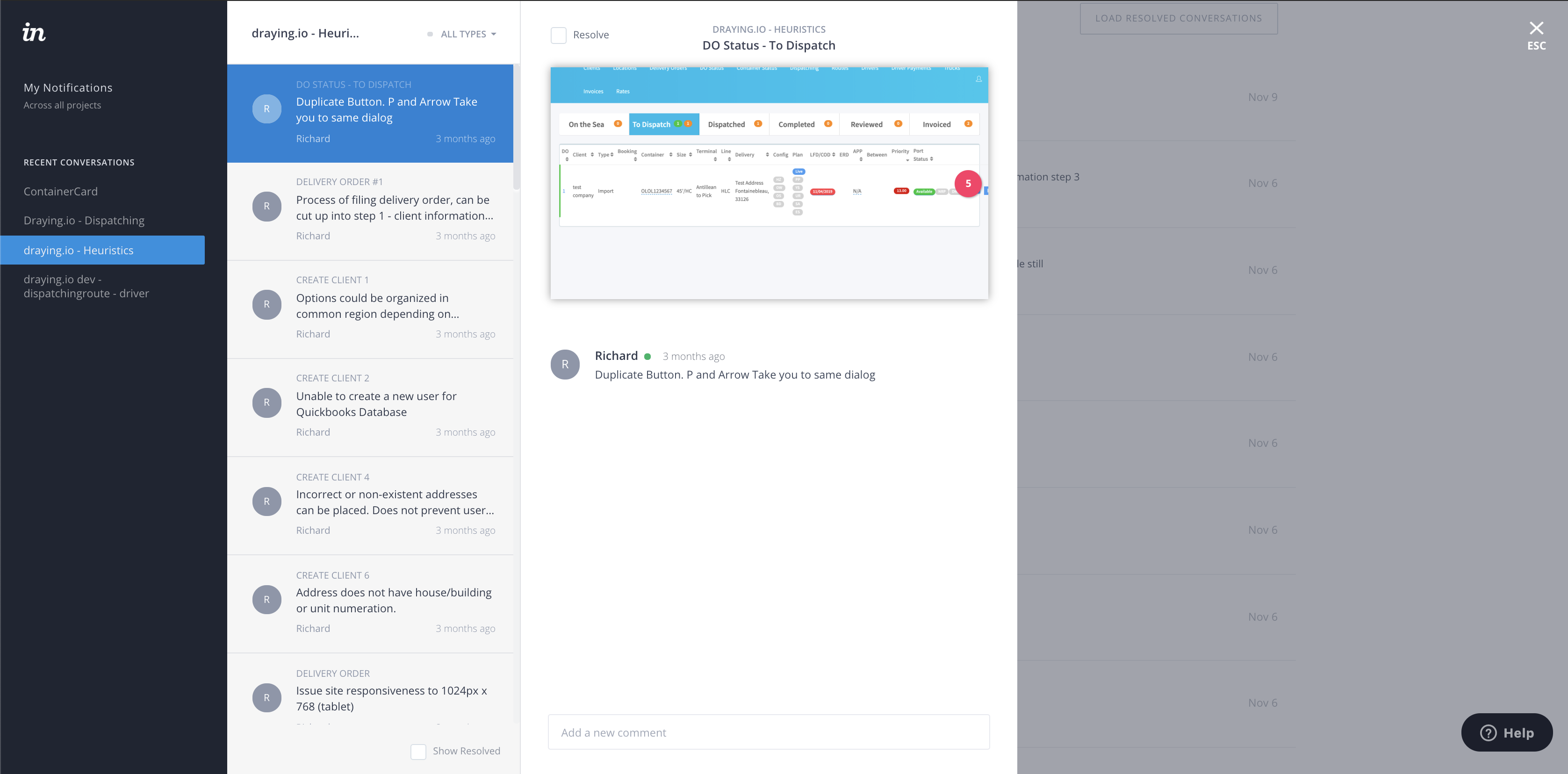
After that I performed a thorough heuristics analysis to comb through the existing product and get down to the details. The inVision prototype was shared with the Client for commenting and for the developer to begin making some quick fixes.
I was now ready to step in the field and observe users “in the wild”. I brought with me a questionnaire, took pictures and recorded audio.The user research always amazes me, because each user has a piece of the answer for the product.
.jpg)
The collected information was sorted and analyzed to begin seeing different patterns that the data would uncover about the user experience. The first level was uncovering the pains and gains.
.jpg)
After that looking at the same data and using the affinity mapping technique I was able to see themes associated with the pains and gains.
.jpg)
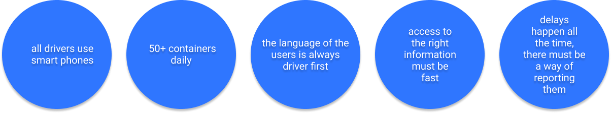
The major insights found in the data where the following:
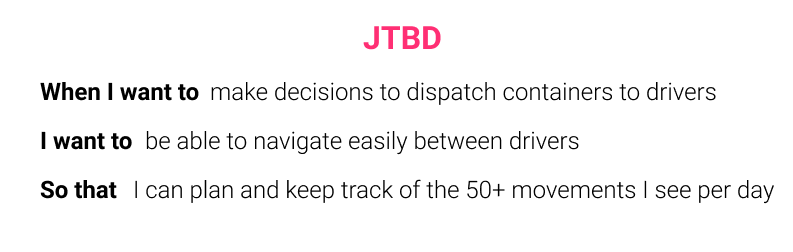
Armed with user insights I began the process of finding the business value proposition; the first step was using the Jobs To Be Done framework.
In the meetings with the Client, we learned that before switching over to their software the users would go through an onboarding process in person Which means labeling all fields in the UI, could be reduced so that there would be less cognitive load.
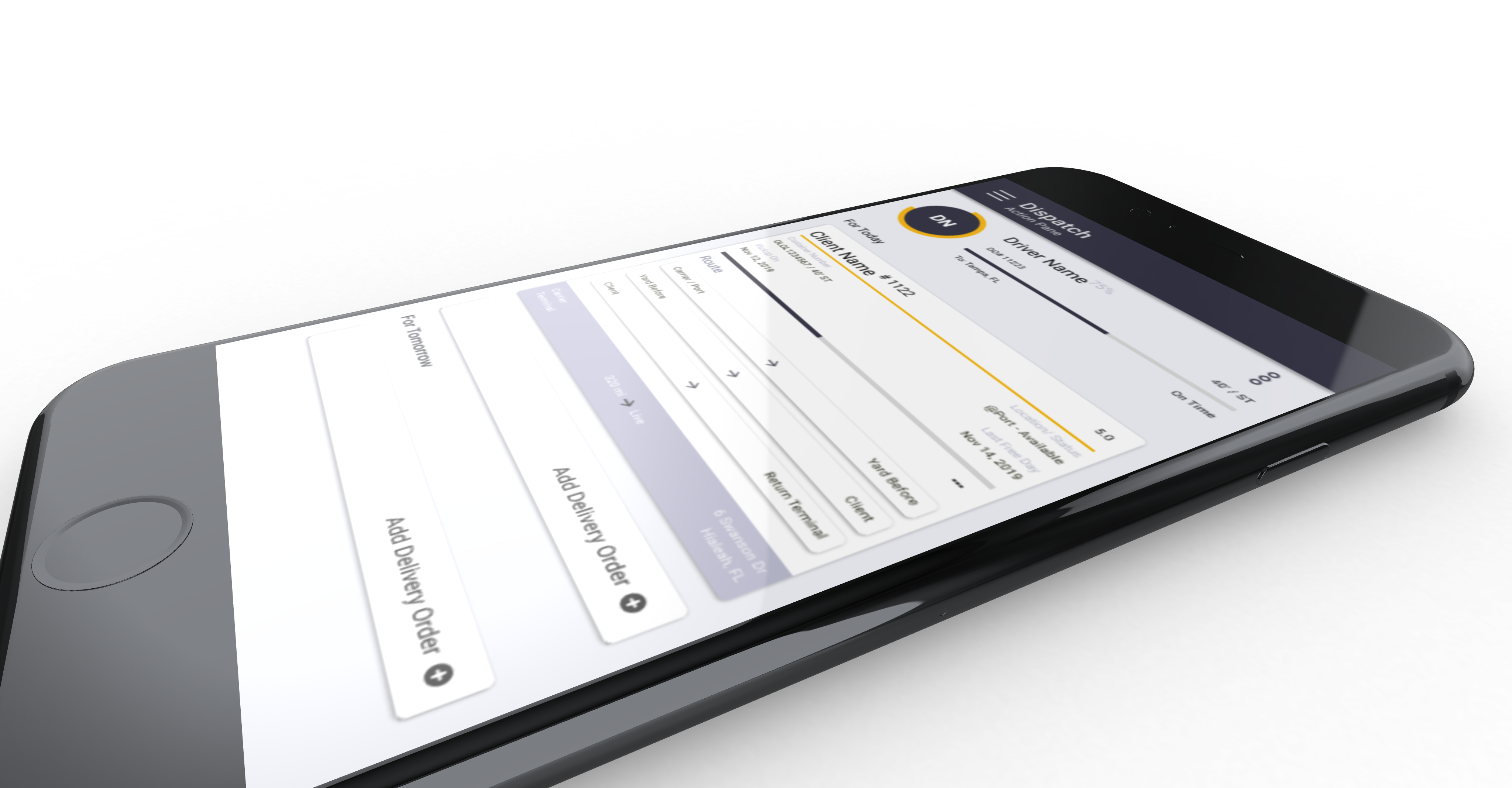
Although mobile was far into the future for this. project, the design would have to be mobile and web responsive for when the time comes.
The most important constraint is that the features and functionality that affected the UI had to be in the final design with some liberty as to presentation. At first we would be designing on the stack that the MVP was built on, which was a bit outdated and very slow.
The user flow diagram was useful in comparing the current user experience with the projected new experience for the screens.
.png)
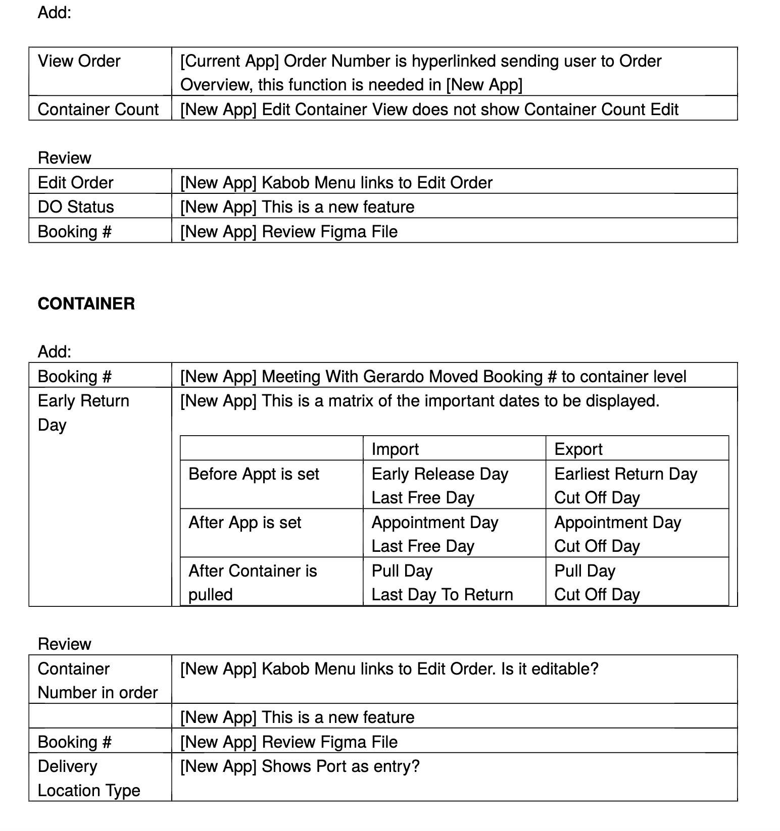
At this point we had to make sure that the existing features and functionality, would be available on the screens and taken into consideration in the design. This meant understanding how data was handled in the back end and where those points met the front end.
.jpg)
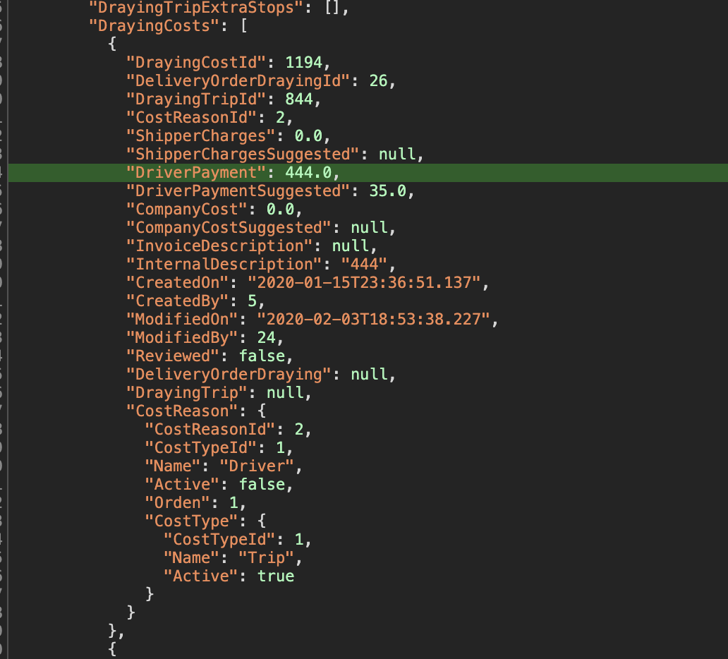
As the project progressed the requirements changed, as there would be a development of the application in react, as well as a GraphQL layer to improve the way the API where called, the meetings with the developers was very challenging at first because the naming conventions on the back end, could have several meanings on our side. A lot of time was spent untangling the meaning of processes, and without documentation in the MVP, the team collaborated on documenting as we went along, to streamline things over time.
.jpg)
.jpg)
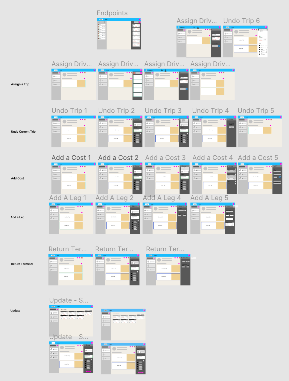
Exploring the IA also led to opportunities for progressive disclosure. In this example, the different stages of a component didn't require all the information all of the time!
.jpg)
Sketching out the components that make up each screen and doing some field mapping while I was at it, allowed me to build these screens on paper very quickly.
.jpg)
.jpg)
By this time I had spent so much time sketching, that I went with paper prototyping to increase the workflow and reduce the redundancy of some sketches.
Once the sketches had been done, and reviewed by the team, I proceeded to think about the interactions. "What happens when I click here?". The interactions where mapped out and prototyped in Figma with the Client, so that the developer would have an idea of what would work like before the visual design layer was completed.
Before developing in React, the client asked for a “quick and dirty” version to roll out on the current stack. Although, not very appealing, the usability report showed success. Below is the actual report I produced.
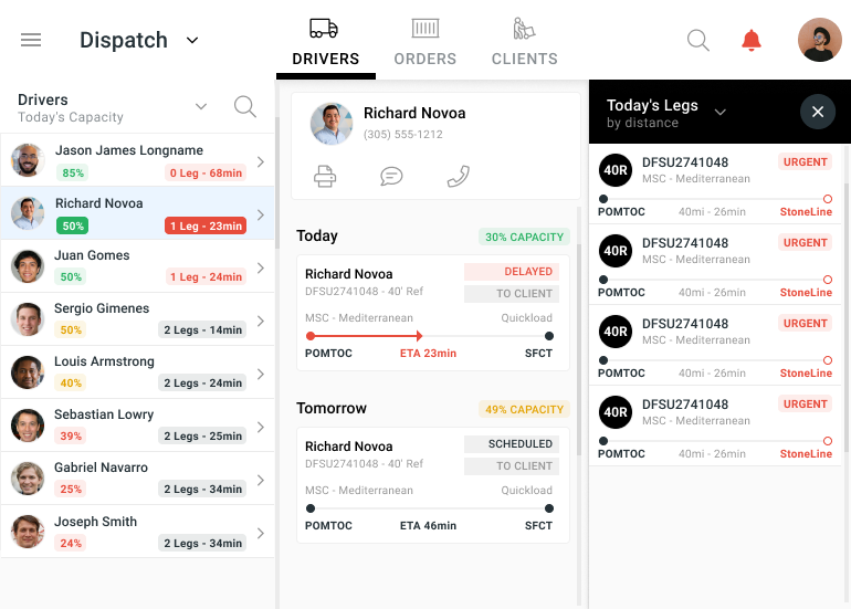
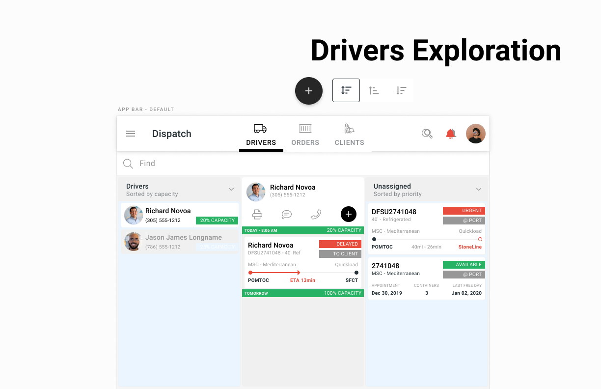
After the “frankenversion’, the first visual design exploration, was designed with mobile view first and I kept to the material.io guidelines on columns for device screens as well as alignment to an 8-pixel grid.
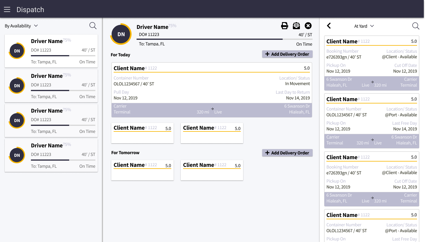
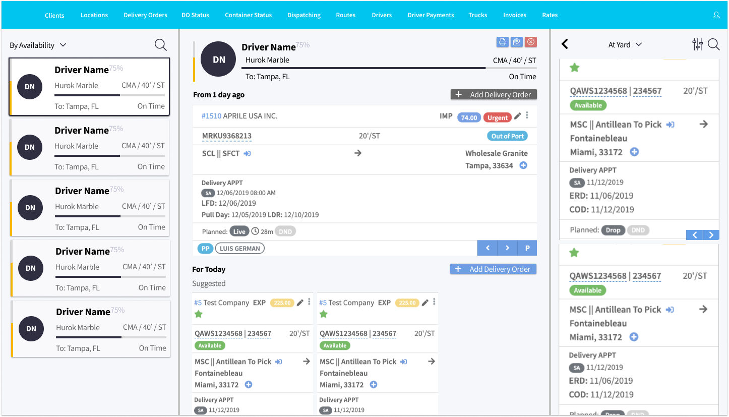
The left column allows the dispatcher to search or pick from the drivers. The middle column opens up a detailed view and schedule of what the driver has to do; the small cards represent loads suggested by the system. The right column slides out when the user doesn't want to use the suggested containers, and allows them to select a container from a sortable list.
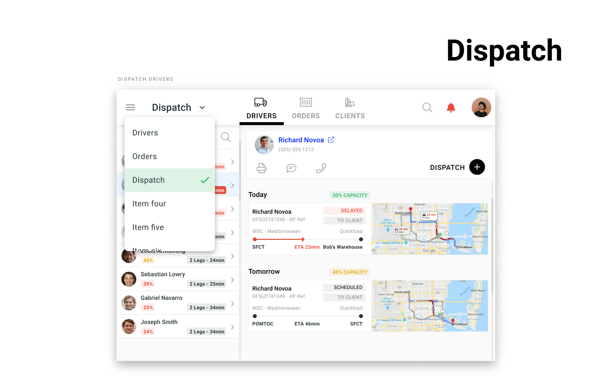
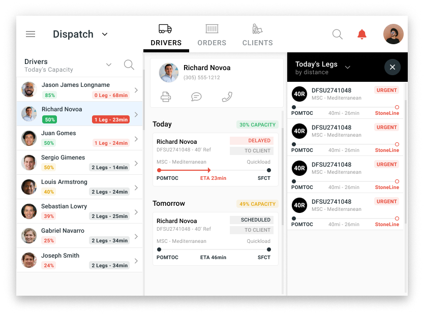
The client was so happy with the results that they green lighted development of the product in react. I began working on another set of screens at this point.
The more senior designers, began to explore visual design concepts that would make the design much more appealing to a mainstream user the results are amazing.
UX research built this project, UI design communicated the insights, this project had a lot of moving parts, and was an excellent source of learning. This was a landmark project for me, there was much more work that went in that what I am able to show here. For a more in depth case study click on the link below.
