Add a Feature: UberEats

A feature that would solve the pain point of receiving cold food. This was a class project but a few months later UberEats rolled out with something similar!
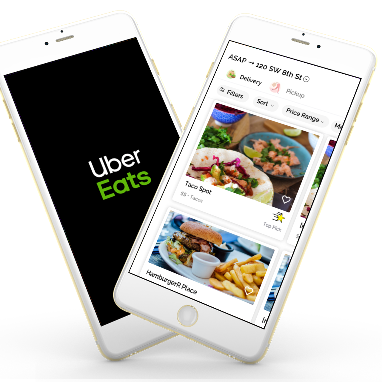
The challenge asked for the creation of a new feature for a popular app, I chose to give it a try with the UberEats app. The feature had to make sense in the real world and follow the design system the application currently has.
I downloaded the following apps to get an idea of what the food delivery market was like. Going through each app was the basis of the features list I created.

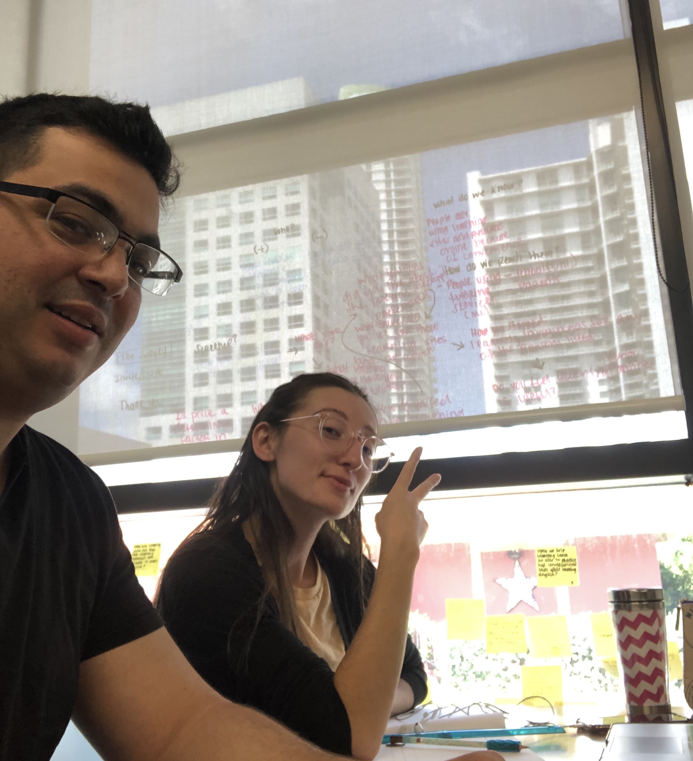
Five qualitative interviews where conducted in the Brickell area of Miami. The interviews consisted of open-ended questions about past experiences with UberEats and competitors.
The common pain points found from the user interviews, where the following:
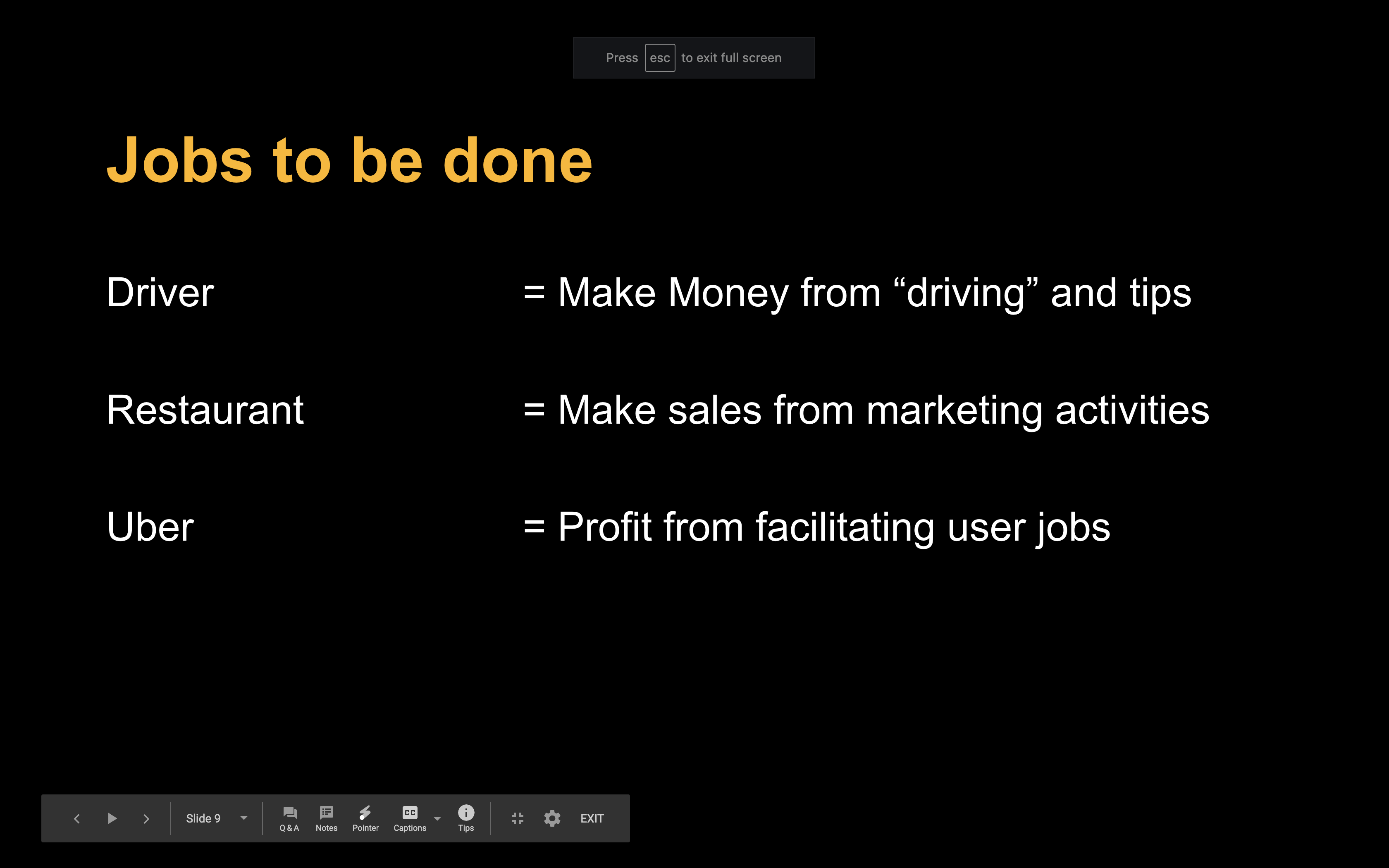
In this particular case focusing on the customer jobs section and applying the Jobs To Be Done (JTBD) framework, allowed me to see that there was a bit of service design to this challenge. It was necessary to take into account the links between the restaurants, the drivers, and the end-user.
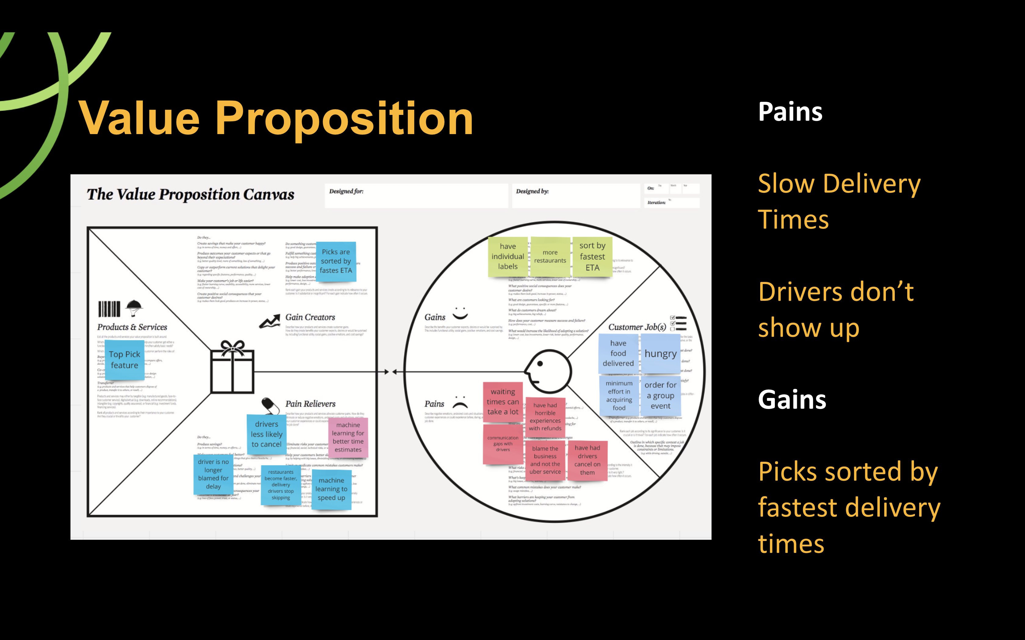
With this I could use a Value proposition chart to make sure the feature would add value to the business and the users.
The assumptions I had with this project was that the restaurant's incentive to report lead times would be strong enough for them to actually do that. This would mean some sort of onboarding and education to the customer, leading to an additional cost for the business.
The constraints on this project where mostly time based, from concept to execution this took 4 days, including preparing a presentation. Because of that I only did the interface for the end user.
I asked a lot of Why's, a shoutout to my days of Lean Manufacturing. What became apparent was the following:
All of this directly contributed to:
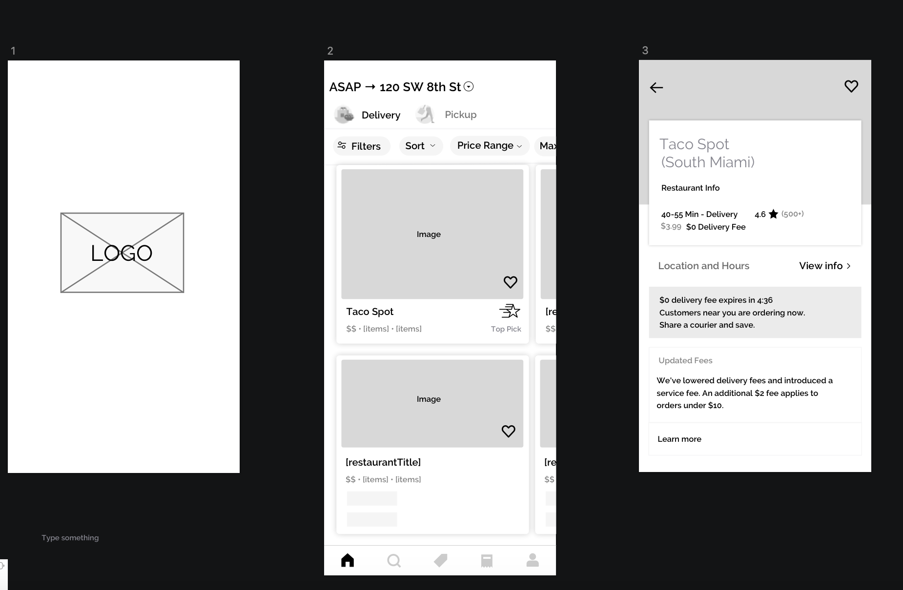
Introducing UberEats Top Pick.
For a restaurant to enjoy this they must:
What will this do:
This will benefit everyone:
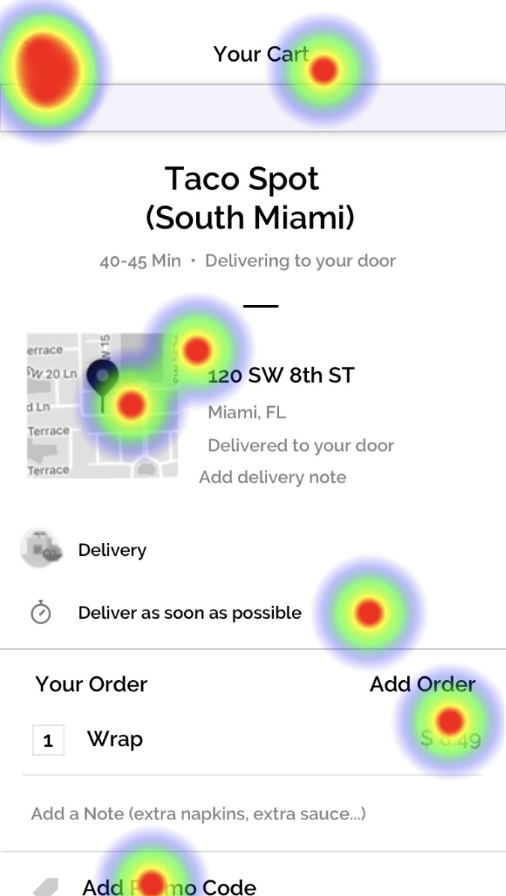
The first usability tests, tested with 5 users, showed the following insights:
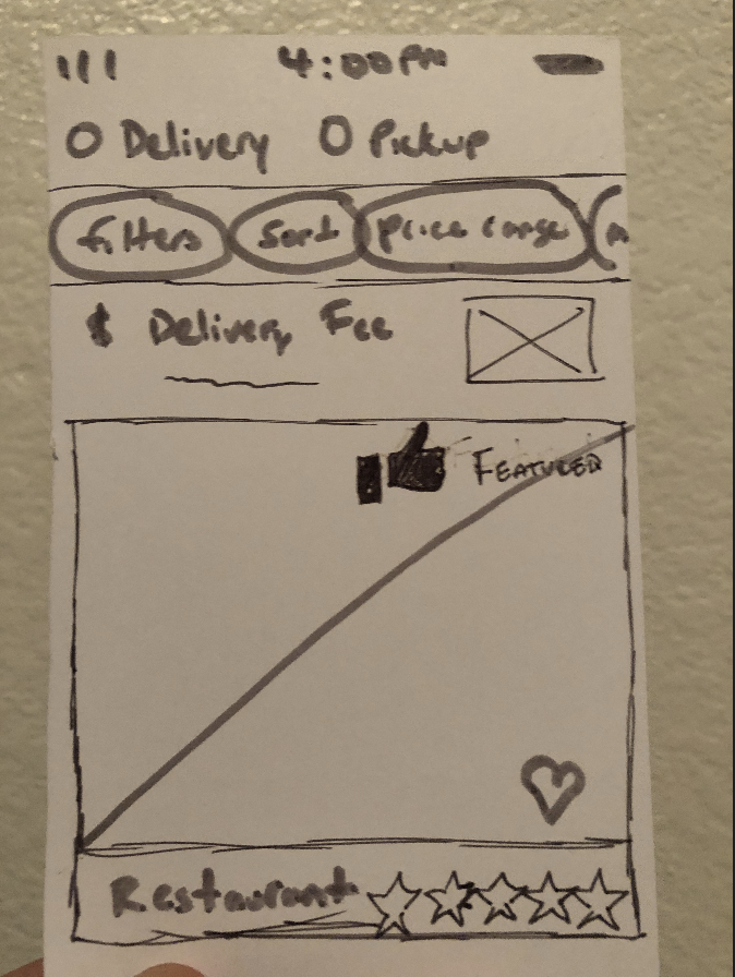
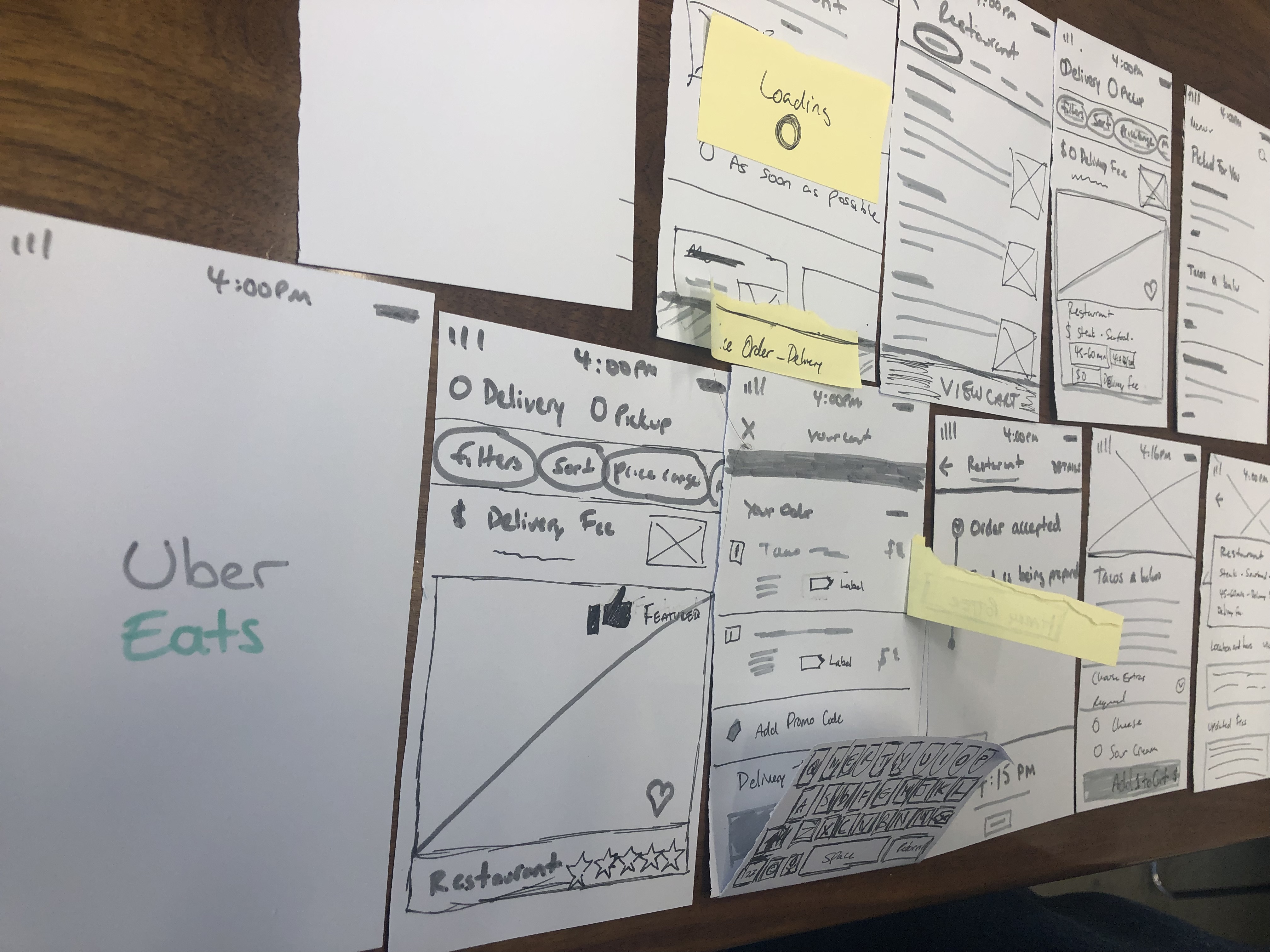
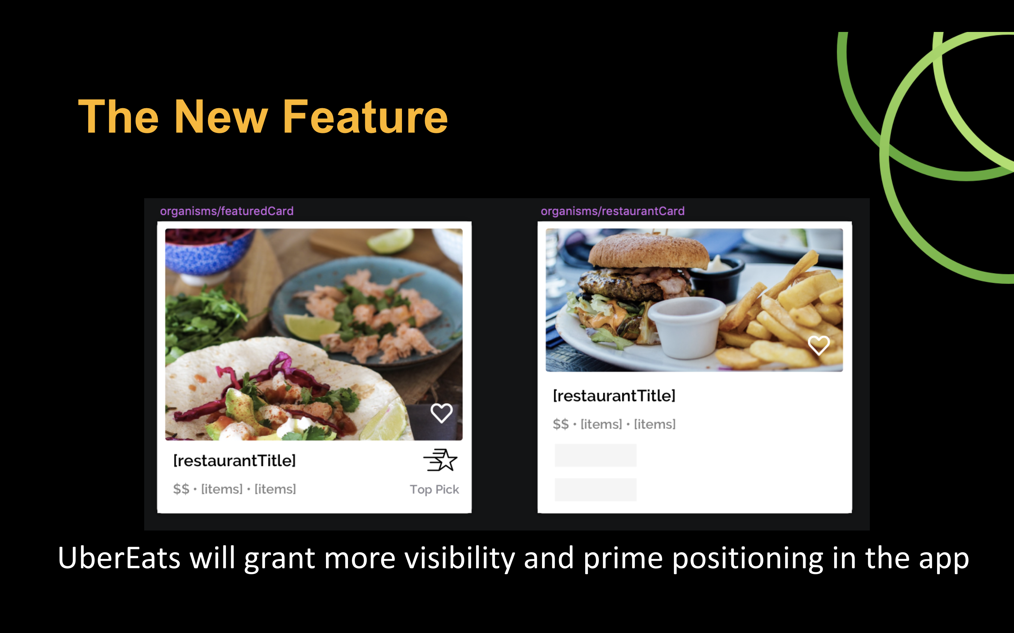
The next part was easy. I used the same cards layout that Uber uses, but adjusted the layout to give ample visual space for the new feature.
I tested with 5 users and found minor navigation issues, that had to do with scrolling on the prototype.
Maze was able to identify where user's where getting lost and showing a heat map.
Most importantly, I did not provide the user with backwards navigation on one screen.
To demonstrate how the feature is different from a normal card I made a side by side comparison.
Here is a run through of the prototype.
This was not an easy project, every idea that came up had in some way or another already been implemented. The UX team at UberEats are incredible, stepping into their shoes for a week to find new opportunities took extraordinary effort. As the story continues, after this project had been finished a few months later I saw this feature roll out on UberEats.
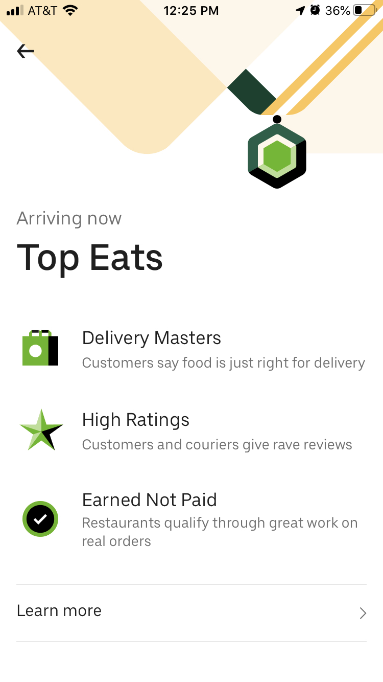
I finished the project mid September and took a screenshot when they rolled out the feature around November/ December.
This was a project in my fourth week of Ironhack. The reason I go back to it, is because a few months later, this feature actually rolled out from UberEats. This was one of those moments of validation that I had hit the nail on the head with the UX.
